
Getting email recipients to open your emails is just one step toward what we really want: for them to take action. Your email design plays a big role in whether recipients will interact with your emails or not.
Good email design supports your message and helps get you results. A poorly designed email template can confuse recipients and may have them hitting “delete” before they’ve read the entire email.
Good graphic designers know how to create email designs that support a pleasant reading experience and drive traffic to your website or social media pages. But what if you don’t have an expert designer on your team?
Not to worry. There are some email design best practices you can follow to build effective email templates and we’ll go over them in this post. We’ll also have a look at different email layout examples. But first, let’s go over the key elements of great email design.
7 Key elements of email design
1. Layout
The layout of your email depends largely on the message you’re trying to convey. It’s a good idea to make an outline of the elements that need to go in your email so you can base your layout on those elements.
Things you’ll want to include are:
- Your header and/or hero image
- Your email copy
- Other necessary images
- Your call to action (CTA)
- Your footer
There are many tactics you can use in your layout to encourage scrolling. A numbered list, such as “Our top 10 tips for winter,” will tease email users into wanting to see everything if you start from number ten and count down to number one.
You can also let your design pull them through the email using arrows and lines. Designing your email templates in a way that trains your subscribers to scroll is another strategy (e.g., placing content such as coupon codes consistently at the end of the email and asking them to scroll through to find it).
Other important tips for creating a good email layout are:
- Include your main call to action both at the top and the bottom of the email, especially in longer emails
- Have a footer that includes all legally required information, such as the unsubscribe link, your company’s contact details, a link to your privacy policy, and so on
- Keep in mind content hierarchy: Put the most important information at the top, and the least important details at the bottom
2. Email copy
Aside from arranging your email body copy so that the most important information is at the top, you also want to keep your copy on-brand and maintain the same tone of voice in your marketing emails as on your other digital marketing channels.
Your email copy needs some styling as well. For that, you can use fonts (see below) as well as text alignment. Try to stick to one, maximum two, ways of aligning your text. While center alignment works well for titles and headings, it’s better to left-align more explanatory copy.
Whatever you choose, keep your alignment consistent throughout the email. Align the same type of text (title, headings, descriptive paragraphs, etc.) in the same way.
3. Subject line and preheader text
If you want recipients to open your emails, you’ll need an engaging subject line and preheader text. There are different tactics you can use when creating your subject line to make it click-worthy and improve your email open rates. Some popular ones are to:
- Create a sense of urgency: “Only one day left”
- Ignite fear of missing out: “Limited edition”
- Add social proof: “Here’s what other customers said”
- Address a problem: “Say goodbye to outdated client records”
- Use humor: “Why we’re the sheet” (from a bed linen company)
- Be informative: “Our Christmas sale starts today”
The preheader text can either elaborate on your subject line or give a little preview of what the recipient can find in the email. Again, there are various ways to go about this.
Senders can:
- Generate curiosity: “25% off these best-selling styles”
Invite action: “Upgrade to our annual plan and get two months for free” - Ask a question: “Do you struggle with outdated CRM records?”
Summarize the email: “30% off everything in store”
Try to keep your subject line under 60 characters to ensure it doesn’t get cut off in your subscribers’ inboxes. Email preheaders are ideally between 40 and 100 characters long. As all email readers have a different cutoff point for the subject line and preheader, and mobile readers tend to show fewer characters than desktop readers, there is no one ideal length for your subject lines and preheaders.
4. Branding
Recipients should be able to tell if an email comes from your brand without reading any of the copy. Being recognizable increases your chances of being seen as trustworthy and helps you stand out against your competitors in your subscribers’ inboxes.
Emulate the look and feel of the rest of your marketing materials. Stick to your brand’s color scheme and incorporate on-brand images. Another good thing to do is to include your brand name or logo in the email header, as well as in the sender name.
5. Visuals
Unless you’re going for the hyper-personal “email-as-if-from-a-friend” approach, visuals are a key element of email design. They make your emails more engaging and allow you to better communicate your brand identity, whether it be colorful, stylish, minimalist, etc.
A best practice when it comes to including visual elements in your email design is making sure that they’re big enough to be clear and not pixelated, and small enough that they load quickly. In general, that means around 1 MB and definitely not bigger than 5 MB.
Images that are too big take longer for email clients to download, which makes for a bad user experience. In worst case scenarios, they’ll make your email land in the spam folder.
Another thing that can turn off subscribers is obvious stock photography. Use original images when you can. If you do need to use stock images, try to collect only those that fit your brand in terms of color, styling, and what they portray.
Animated GIFs are a little different, as those often rely on well-known images for comic effect.
6. Call to action
Effective email design will lead recipients to your call to action, but then they still need to actually take action. Your calls to action are most enticing when they stand out. You can use a bigger font size, make them bold, underline them if they’re links, and give them a pop of color if you’re using call-to-action buttons.
When it comes to the copy of your calls to action, you can get creative as long as you use active language. While a “buy now” or “get in touch” message can work just fine, you can adapt your calls to action to be a bit more on-brand. Go for a “Give it to me!” if your tone of voice is more conversational, or a “Learn more” if it’s more reserved.
Keep in mind that your calls to action don’t always need to be calls to order. They can also invite recipients to get in touch with you, browse product reviews, read a blog post, follow you on social media, or even visit one of your physical stores.
7. Your audience
While not directly an element of email design, your target audience is a key factor to consider when you’re deciding on your email design.
What kind of people or businesses are they? Why are they following you? How do they expect you to talk to them? The email design of a luxury jewelry brand targeting women with a high disposable income will be different from that of a SaaS chatbot targeting course creators, for example.
Email design best practices
Whether you’re working on an email newsletter design, specific email marketing campaigns, or updates to your transactional emails, it’s a good idea to follow these best practices.
Make it mobile-friendly
Most email service providers (ESPs) have built-in drag and drop editors that default to designing in desktop view. Luckily, most of them also allow you to check whether your design is mobile-friendly or not.
By using the mobile preview mode of your email builder, you can check if your design is responsive. Make sure that elements are stacking in a way that makes sense visually, and that the font is resizing correctly or is still easy to read if it’s part of a graphic. Utilize a previewer tool like Litmus from Validity’s design test functionality to see how the email will render across different desktop, mobile, tablet, and webmail clients.
In general, a one-column layout works better on a mobile device than a multi-column layout. The latter sometimes aren’t even fully responsive, meaning a reader would need to zoom in on their mobile device to be able to read your email. Not ideal.
Litmus from Validity allows you to preview your email design across a wide of devices to ensure it is mobile responsive.

Be careful with your fonts
Less is more when it comes to fonts. Try not to use more than two different font families and don’t make your fonts smaller than 14pt. If your target audience is a bit older, they’ll probably appreciate bigger, darker, and bolder fonts as those provide better readability. Bold typography also works great for titles.
While cursive and decorative fonts can look nice, keep in mind that they’re also harder to read. Similarly, the font you use on your website might not work as well for email. As a general rule, sans serif fonts feel cleaner and clearer online than serif fonts.
Not all fonts will display properly in every mail client, so it’s important to do design tests to see how your brand’s font renders across different mailbox providers and devices. If you’re using a web font, set a fallback option from a list of web-safe fonts, such as Arial and Helvetica.
Think about accessibility
Email accessibility should always be a concern. Having accessible email designs benefits not only the users who have images turned off or whose email clients don’t automatically download images, but also the millions of people worldwide who have visual limitations.
Add alt text
By adding descriptive alt text to your visual content, you can have an email design that’s both engaging and accessible. The word “descriptive” is key here. The alt text should adequately describe what an image, video, or GIF, represents. For example, <img src=”logo.png” alt=”Validity Logo” /> describes that the image represents the Validity logo.
Create a simplified text version
If you can edit the text version of an email, make sure that it is simplified and easy to read. This helps with screen readers and can be the version of your email that is seen on devices like smartwatches.
Use contrasting colors
People with color blindness or moderately low vision can have difficulty with some color combinations, especially if there isn’t enough contrast between the text and background canvas of an email. Use software like Litmus‘ design tool, which has a colorblind test, so you can check whether the design has enough clarity to be read by all audiences.
Break up text blocks
Most people don’t subscribe to email newsletters expecting to get sent a wall of text. People are busy, on the go, and most frequently opening emails on their mobile devices. Big blocks of text can feel overwhelming and may even turn people off from reading your emails.
That’s why it’s important to break up your text by adding some engaging images, in-line links (as long as they’re relevant), and plenty of white space.
A common mistake many email designs fall into is trying to look exactly the same as the brand website. Emails should be an extension of your company’s website, not a re-creation of it. For the majority of emails sent, the goal is to intrigue subscribers into clicking through to your website to make a purchase, leave a review, choose a service, set up a demo, etc.
If your email is trying to say too much to make it really effective, it might be better to have that content live on a new landing page on your website and use the email to direct subscribers there.
Personalize your emails
Email personalization should be top of mind as you gather data about your customers. When you know your subscribers’ names, birthdays, interests, and shopping behavior, you can add dynamic content to your emails that offers them a more personalized experience. A shopping section based on their shopping history, for example, is more likely to appeal to someone than a random assortment of products.
You can also look into adding countdown timers, weather or stock updates, and the use of accelerated mobile pages (AMP) to support features such as carousels and surveys.
Create your own email templates
While you can use the pre-made templates many email design tools offer, the best way to create effective email designs is by building your own templates that you then continuously improve.
Have a default email template design for each email campaign and run A/B tests to identify better-performing variations of your design. Once you have enough data to believe a new variation (a different layout, color palette, CTA, subject line, etc.) will perform better, it’s time to adapt the default template and test something else.
Examples of email design layouts
Your email design influences the reading flow of your recipients. Meaning, the way you structure your written and visual content will affect how readers literally move their eyes along your email.
Design is a tool used to direct the eye in a specific pattern based on your goals. Common types of design layouts are the inverted triangle, zigzag patterns, color blocking, and text overlay.
Inverted triangle
This design tends to start wide with a horizontal image and a short block of text underneath, followed by a slightly narrower CTA button as the focal point. This draws the eye into a simple pathway to really highlight the action of clicking through to the website, so the button doesn’t get lost in the design.
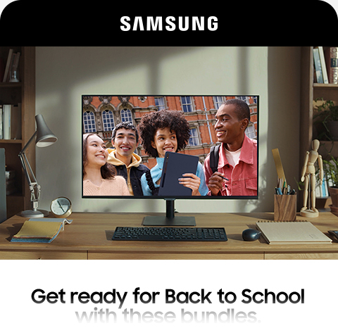
Samsung uses this technique with the hero image leading into a narrower block of text that tapers down into the CTA “Shop Now” button. They also design their emails to be a similar shape to a phone screen, which further showcases their products.
Zigzag
This pattern guides the eyes in a side-to-side pattern and down through the email. It leads you to move smoothly from element to element and helps make sure the subscriber notices all the important information the email is trying to convey.
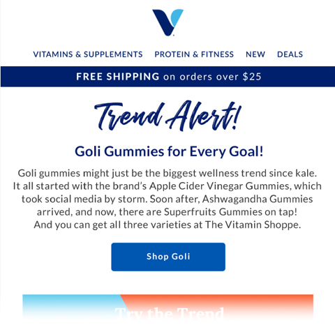
The Vitamin Shoppe features the zigzag design in their email showcasing a new product. The bright colors of the labels help make this a visually exciting email to scan through, as well.
It’s very common to see multiple elements within one template, most often the Inverted Triangle and Zigzag:

This Marriot Bonvoy email uses the inverted triangle at the top to highlight the main CTA, followed by a zigzag pattern to guide the subscriber so they read all the way through the secondary elements.
Color blocking
Bold, bright colors are exciting and eye-catching. When used correctly, they can play with emotions and get the subscriber engaged in the content.
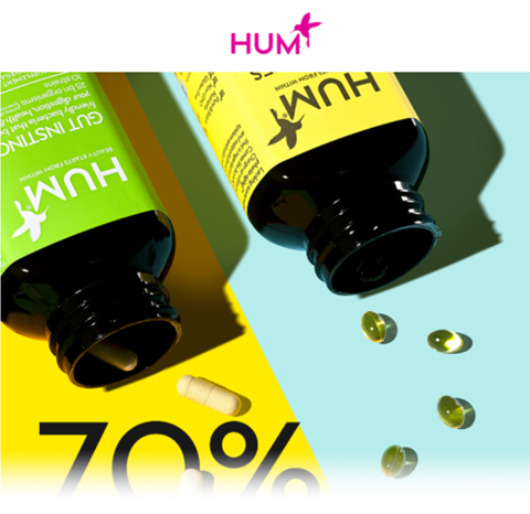
Hum Nutrition uses bright and fun colors to bring excitement to their campaign. They use colors that go well with their labels to help make their product pop.
Toned down, subtle colors also work well to block out sections of the design and make the product pop.

Tushy utilizes ample neutral tones in their designs and lets their cheeky text bring out their boldness. Their products tend to be lighter colors, so using neutral tones is a smart choice to keep the products from being overshadowed.
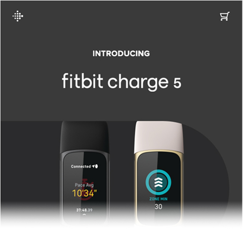
Text overlay
Let your product do the talking and have a simple email featuring an image with a very small amount of text and CTA. This works as a tease and entices people to click through to learn more, since the email doesn’t provide every single detail.
It’s also important to note that white space in your email is indispensable. Don’t be afraid of white space; use it as a design tool to really draw focus to the elements you’re trying to highlight. Despite the name, white space doesn’t have to be white. It can be any color. The name refers to space in the design that isn’t filled up with text, graphics, icons, or buttons.
This Fitbit example demonstrates the value of a very simple design that looks elegant and eye-catching, without any clutter.
Better email marketing design means better results
To have a successful email marketing campaign, you need more than good email open rates. You need recipients to take action. An effective email design combined with strong copy helps you:
- Increase brand awareness and recognizability
- Keep readers engaged from top to bottom
- Lead recipients to your call to action
- Get subscribers to take action
Discover how Litmus from Validity can help you test your email designs to ensure you’re delivering the best possible experience and enticing your recipients to engage.