Email Deliverability
Deliverability 101: Design your emails with framework and hierarchy in mind.
minute read

If content is king, consider layout the queen.
Building the structure of an email is just as important as the content within. An improper or imbalanced layout can mess with your engagement, and thus screw with your sender reputation. If you want good deliverability, you must be compatible with multiple email clients, many of which are outdated and do not support the most basic web standards. Not to mention, emails are read on different devices, forcing you to also tackle mobile and tablet optimization.
When your email doesn’t render, you risk being marked as spam. Faulty emails appear sketchy, ultimately scaring off subscribers. What takes a hit? Your deliverability and ROI. Ouch. Avoid the battle and conquer email design with these best practices in mind.
Structure and Optimization
Whether you build your own email or borrow a template through an email service provider (ESP), make sure you are following basic email standards. Without a solid foundation, the contents inside hold no value.
Designing from scratch?
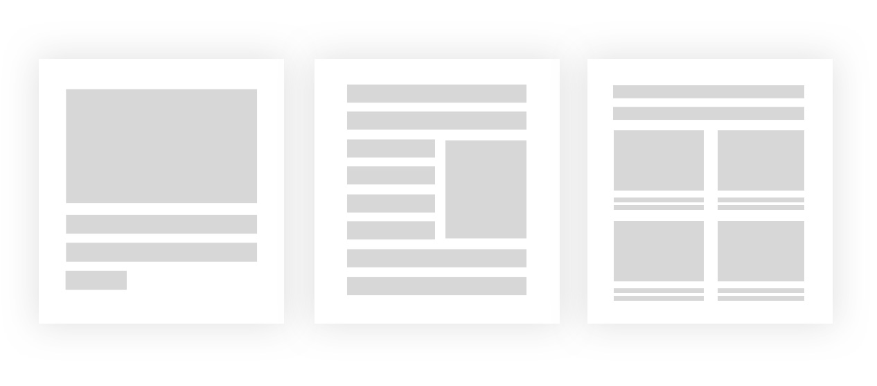
To avoid complications, frame your email to fit within an email client’s preview window on any device to lower the risk of losing a subscriber to scrolling. The industry standard is 600 pixels. Keep things simple and stick to a basic one-column design. Less shifting and moving makes it easier for your audience to read your content and for device optimization.
If you’re interested in an elaborate design, you will encounter several testing and debugging email client issues. Be ready to use a lot of tables and to set a good amount of time aside for testing. To create the overall layout, you will need to use standard HTML tables. CSS floating and layout techniques will not render properly across all email clients.

Designing with a template?
Templates alleviate a majority of the structural issues marketing teams endure (i.e., 600 pixel width, columns, and responsiveness). Spend time choosing a professional template that reflects the right tone for your brand and message. This will make designing the rest of your email easy. A pre-built template gives you a unique, custom look once brand logo, colors, images, and personalized messages have been added.
Responsiveness
A seamless mobile experience is essential if you want to improve engagement. It’s not a secret the majority of emails are read on mobile devices. But implementing a responsive email design can be a royal pain.

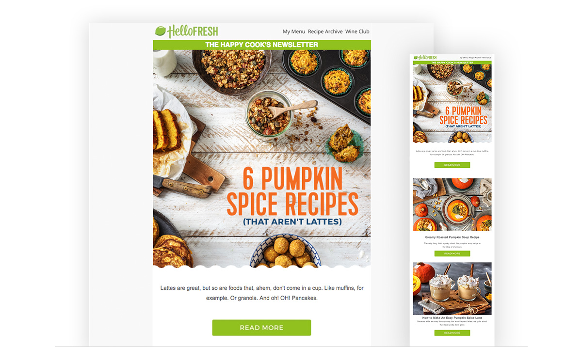
If you’re using an ESP, you should have a number of options for responsive email templates. These templates make it easy to ensure your emails can be read effectively on smaller screens. One column emails work beautifully on desktop and mobile. Your layout should adapt to the host device and email client with scaling images and border. This helps subscribers navigate the email without overwhelming them. The one column design makes it obvious what information is important and what you want a consumer to do next.
Hierarchy
Every kingdom has a hierarchy, as should your email design.
Your layout should help the viewer know what they should check out first, and where they can go from there. The more you ask your email recipient to do in order to read your message, the more likely they are to lose interest. Subscribers should be able to scan the email quickly using a logical hierarchy with large headlines, relevant images focusing the reader’s attention, and a clear call-to-action (CTA) button to encourage conversions.
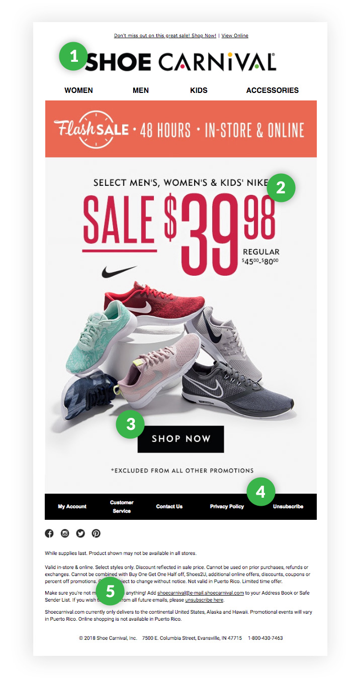
5 points of hierarchy to follow:

- Start with your logo or company name. This is the face of your brand. Remind subscribers they know you and are safe to keep reading.
- Section off content with a large headline and/or image to draw attention and optional copy below for additional context.
- Add CTA to gain click-throughs. Direct your audience on what to do next.
- Appreciate space. Give the eye room to rest in between content. Repeat steps 2-4 until campaign content has been reached.
- End with the footer, the typical spot for addresses, social, and unsubscribe language.
Structure the elements of your content so they work together to draw people in, deliver the key messages of your campaign, and get them to click through.
Testing
In a perfect world, all email services would display emails the same way. There would be no default setting to block images or funky changes to the spacing of your text. You wouldn’t have to worry about your email content getting clipped.
But the world isn’t perfect, so armor up your deliverability. Previewing your emails before sending them to your audience allows you to view your email from your subscriber’s perspective: In an inbox similar to theirs from a desktop or mobile device. With a testing service, you can see how your email will render across numerous email clients and devices all at once.
Go beyond face value with 250ok Design. Test your best designs and peek into inbox placement, Cloudmark content score, and more, even before you send. It’s everything you need to test, optimize, collaborate, and feel confident in your email design.
Yes, queen.