GridBuddy Cloud User Guide
- Terminology
- User Roles
- Modules
- Users and Data Security
- Access Rights and Permissions
- Features
- Enabling SSO for an Organization
- Group Management
- User Management
- Adding Datasources
- Setting up SSO and OAuth 2.0 Client Registration in SAP Hybris
- Creating Grids
Introduction
GridBuddy Cloud is an application for the mass creating, editing and deleting of multiple objects within one view. One parent object (such as Accounts) and up to four child objects (such as Contacts, Opportunities, etc.) can be exposed in each
Grid. GridBuddy Cloud supports objects from multiple datasources including Salesforce and SAP Hybris C4C.
Users with grid administrative access utilize the 3-step Grid Wizard to:
- Configure the Grid to include almost any object
- Specify access to records on a grid (create and edit)
- Select the fields to be exposed for each object
- Specify access to records at an object level (create and edit )
- Define filters to determine which records to show, how many and in what order
Grids can be distributed by running from GridBuddy Cloud or embedded into a native application as an iframe.
Create or update records using the “Edit”, “New / Edit”, and “Save” buttons. Large Grids will appear on several pages that can easily be navigated. Users can increase or decrease the number of records per page, expand and collapse views on an
object or page level, and open record detail pages.
Objects from datasources will maintain field level security, validation, permissions, workflows, and triggers are incorporated on a per user basis.
Terminology
|
Organization |
A customer with a GridBuddy Cloud account. The Organization Admin has access to the Organization-level settings. See Modules for more detail. |
|
User |
A user with any level of access in GridBuddy Cloud. See User Roles for more detail. |
|
Datasource |
A connection the Organization Admin configures on the Datasource screen that points to a live system. The configuration entails various details that will enable GridBuddy Cloud to establish a connection and The Organization Admin uses their own account credentials to setup the datasource, but other users will be prompted to specify their credentials in order to authenticate to the datasource. GridBuddy Cloud connects to Datasources are then accessible and referenced in several places in the application. They are required to exist in order for an admin to configure a grid, and for end-users to access grids. |
|
Grid |
The end-user data management screen that most GridBuddy Cloud users will interact with. This interface queries the objects specified in the Grid definition (through the Grid Wizard) to present data that end-users can |
|
Grid Wizard |
A 3-step wizard an admin uses to define the objects, filters, and display settings for a particular grid. |
|
Metadata |
GridBuddy Cloud uses meta data understand the objects and fields in your datasource and to display dependent and record type picklists, lookup filters, and lookup layouts on grids. |
User Roles
There are 3 user roles within GridBuddy Cloud: Organization Admin, Grid Admin, or Grid User. A user may only be assigned to 1 role.
|
Role / Module |
Organization Tab |
Manage Grids Tab |
Grids Tab |
|
Organization Admin |
x |
x |
x |
|
Grid Admin |
x |
x |
|
|
Grid User |
x |
Modules
There are 3 primary modules within GridBuddy Cloud:
|
Organization tab (aka Org Console) |
Enables privileged users to manage Organization Settings, Datasource Connections, and Users within the organization. Organization Settings – includes name, description, active grids visibility option, and subscription details. Datasources – create, edit, test, delete connections to external systems such as Salesforce and SAP Hybris. Each datasource requires different information to establish a connection, these are displayed dynamically to Users – create, edit, delete users who are part of the Org Admin’s organization who should have GridBuddy Cloud access. This includes setting the user’s role (see User Roles for access details). Security Settings – manage Password Policies Groups – Assign groups of user to specific groups to control grid access. |
|
Manage Grids tab |
Enables privileged users to create and manage grid configurations (through the Grid Wizard), and grid-related functionality including Actions and Extensions. Grid Wizard – consists of 3 steps: 1. Choosing the parent/starting object from a particular datasource, 2. Choosing fields to display for the starting object and other objects, 3. Defining filters on the selected Actions – create, edit, delete actions that can be launched on a single record, multiple records, or globally from the Grid. Actions can be associated to one or more grids through the Grid Wizard. Extensions – create, edit, delete reusable extensions that can be associated to grids. |
|
Grids tab |
Enables privileged users to access grids for data management |
Users and Data Security
See Datasource under Terminology for datasource connectivity as it relates to individual users. When GridBuddy Cloud users request data from a datasource, GridBuddy Cloud
will apply security rules that the datasource (underlying system) exposes including object-level, field-level, and record-level rules. GridBuddy Cloud also offers ways to apply custom permissions per Grid in addition to the datasource’s
permissions, including object-level, field-level and record-level. Custom permissions within GridBuddy Cloud will never give users more access than they have in the source system, custom permissions are additive.
Access Rights and Permissions
- For SAP Hybris, you must set access rights for the users, in order to access grid data. Login to your SAP Hybris C4C instance. To do that, login to your SAP Hybris C4C instance, go to Administrator > Users > Business Users, click Edit
> Access Rights. Go to Work Center and View Assignment tab. - If the user needs to load grids of Accounts, assign them the CODACCOUNTWC work center.
- If the user needs to load grids of Opportunities, you will also need to assign them the COD_SALES_WCF work center.
- For admin users, assign them the SEODADMINWCF work center.
- For Salesforce, you must enable API access, in order to access grid data. You must also have at least read access to some objects.
Features
- View, edit, and create new records from one parent object and multiple related children on one screen
- Define Grids easily using a 3-step wizard
- Select fields to appear in the Grid
- Filter records on a per object basis
- Order records on a per object basis
- Specify entire Grids, or individual objects within the Grid, as editable or read-only
- Specify whether the user can create new records in the entire Grid for individual objects
- Access Grids from a custom link
- Security permissions and validation rules enforced on a per-user bases for each datasource in the Grid
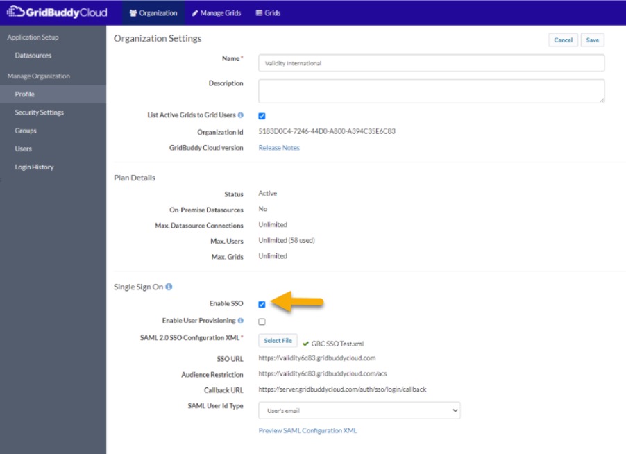
Enabling SSO for an Organization
Before enabling SSO for the GridBuddy Cloud organization, It’s recommended to keep one Org Admin user that is not SSO enabled.
- Select “Organization” from the top menu
- Click “Profile” in the left navigation, this takes you to the Organization Settings page
- Enable the “Enable SSO” checkbox.
- Upload Identity Provider metadata by clicking “Select File” and then selecting a file. The GridBuddy Cloud Callback URL is: https://server.gridbuddycloud.com/auth/sso/login/callback, where the subdomain will match the subdomain in the SSO URL.
- Set “SAML User Id Type”. If “User’s email as federation id” is selected, you’ll also need to specify the Business Email Domain.
- Copy the SSO URL from this screen, this is the URL you will use to login to your org with SSO.
- Click “Save”
- Note the “SSO URL”
- Log out of the org
- Go to “SSO URL” for your org and you will be taken to the SSO Login page. Click the Login with Single Sign On button and you should be taken to the login page for your Identity Provider. Enter the credentials and then you should be logged and
redirected to GridBuddy Cloud.
Please note that SSO users will need to login with your organization’s SSO URL after enabling SSO for an org, i.e. if your organization’s name is “Acme”, then SSO users would use https://acme.gridbuddycloud.com instead of https://www.gridbuddycloud.com
Group Management
Groups enable admins to specify which users can access which grids. This is done by creating groups, assigning them to grids, and then assigning a group to users. Groups can be assigned to users of all role types, however groups are only
applicable to users with the role of Grid User. Organization Admins and Grid Admins can access and manage all grids in the organization, irrespective of the group they belong to. Groups are an optional setting. When an organization has no groups
defined then grid visibility is based on whether the grid is active or not. If an organization does have groups defined, but a grid is not associated to any groups, then Grid Users will not have access to the grid.
Note – Please make sure in the organization settings “List Active Grids to Grid Users” is checked.
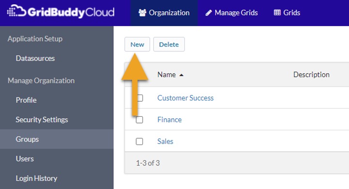
Adding Groups
Steps to create groups:
- Select “Organization” from the top menu
- Click “Groups”
- Click “New”
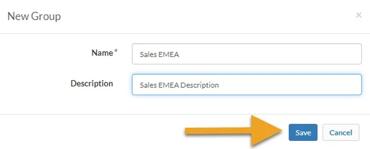
Assigning Groups to Users:
- Set a “Name” and “Description”
- Click “Save”
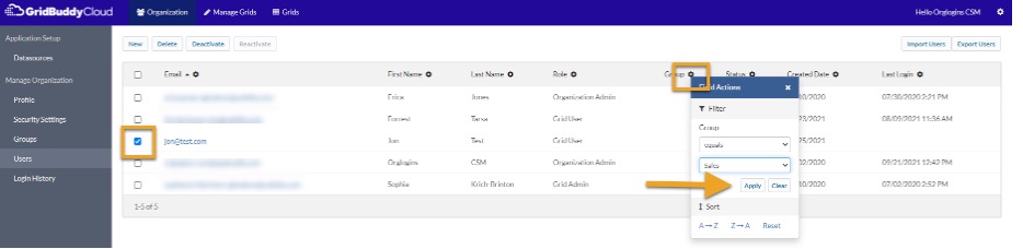
Assigning Groups to Users:
To assign a user to a group you must be logged in as an Organization Administrator.
- Select “Organization” from the top menu
- Click “Users”
- Select a user
- Assign user to a group from the group dropdown.
- Click “Save”
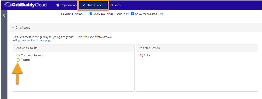
Assigning Groups to Grids:
To assign groups to grids you must be logged in as an Organization Admin or Grid Admin.
- Select “Manage Grids” from the top menu
- Click on a grid
- Assign groups to a grid in the “Grid Access” section.
- Click “Save”
User Management
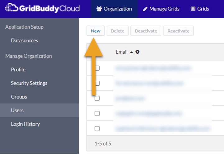
Adding New Users
Steps to create a single user:
- Select “Organization” from the top menu
- Click “Users”
- Click “New”
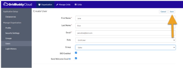
- Set a “First Name” , “Last Name” , ” Email” , “Role” and “Group” for the user. Enable the “SSO Enabled” checkbox if you want to set up this user for SSO.
- Click “Save”
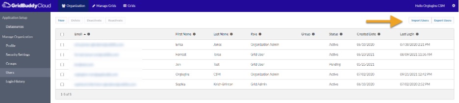
Steps to create multiple users:
- Select “Organization” from the top menu
- Click “Users”
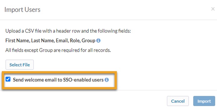
- Click “Import Users “
Steps to create multiple users:
- Follow instructions in the popup to create a CSV file with the fields you want to create on the user. See sample CSV formats below. Limit the CSV file to 1,000 users.
- Click “Select File ” and then select the CSV file
- Click “Import”

If SSO is enabled for an organization, there will be a checkbox in the Import Users popup, “Send welcome email to SSO-enabled users”. This checkbox will be checked by default. If you uncheck this checkbox, then SSO users that you import will not
receive a welcome email.
Sample CSV format if SSO is enabled for the organization:
First Name,Last Name,Email,Role,SSO Enabled, Group
Jane,Smith,[email protected],Organization Admin,true,IT
Bryan,Stevens,[email protected],Grid Admin,true,Marketing
Amy,Lynn,[email protected],Grid User,true,Sales
Sample CSV format if SSO is disabled for the organization:
First Name,Last Name,Email,Role
Jane,Smith,[email protected],Organization Admin
Bryan,Stevens,[email protected],Grid Admin
Amy,Lynn,[email protected],Grid User
Deactivating Users
To deactivate a user you must be logged in as an Organization Administrator.
- Navigate to Organization -> Users
- Select users to deactivate
- Click Deactivate
- Confirm that you would like to deactivate
- Observe the user status change to ‘Inactive’
Reactivating Users
To reactivate a user you must be logged in as an Organization Administrator.
- Navigate to Organization -> Users
- Select users to reactivate
- Click Reactivate
- Observe the user status change to ‘Never Logged In’ for SSO users and ‘Pending’ for non-SSO users.
Note: Upon reactivation, non-SSO users will have to set a new password to gain access to GridBuddy Cloud.
User Statuses
- Active: User is currently active on GridBuddy Cloud.
- Inactive: User account is deactivated and cannot be used to access GridBuddy Cloud. All user data, like grids, are intact and active
- Pending: Non-SSO user account waiting for activation and first login by the user.
- Never Logged In: SSO user account waiting for the first login by the user.
- Locked Out: Non-SSO user locked out of the system after multiple retries with an incorrect password.
Note: Users in the Inactive state are not counted towards the organization’s license limit (max users).
Adding Datasources
Before a grid can be created you must connect a datasource. To add and connect datasource you need the datasources’s credentials. The datasource connection us used to get the datasource’s metadata is used by GridBuddy Cloud to understand the datasources objects, fields and related objects that make up your grids.
To add a datasource, click on the “Organization” tab, click on “Datasources” and click “New”.

To add a specific data source, continue to “Adding a Salesforce Datasource” or “Adding a Hybris C4C Datasource”
Adding a Salesforce Datasource
To add a Salesforce datasource, select “New” from the Datasource Page and do the following steps
Steps:
- Select “Organization” from the top menu
- Click on “Datasources”
- Click “New”
- From the Datasource type dropdown, select the datasource “Salesforce”
You need to provide a Salesforce Account to connect. These credentials can be an API User or Salesforce user. The Account must have API Access enabled. Provide the account username, password, and security token as Salesforce. Pick the Salesforce
Uri of Production or Test.
After saving the metadata will be fetched. You should also test the connection. After testing the connection activte you datasource to be used in a grid.
| Example:
User: [email protected] Note: Use “Production” Uri for Production and Dev salesforce Orgs and “Test” for sandboxes. |
 |
Enabling SSO Salesforce Datasource
Enabling SSO for Salesforce Datasource automatically authenticates a User a grid that is configured against a Salesforce data source if that grid is embedded in Salesforce.
Before enabling SSO for salesforce. It’s recommended to have a user already set up in Salesforce with the user name that matches in GridBuddy Cloud organization.
- Select “Organization” from the top menu
- Click “Datasources” in the left navigation, this takes you to Datasource list view
- Click “New”, this takes you to the Datasource creation page
- Select Datasource Type “Salesforce”
- Check “Use SSO”
- Download the JKS Certificate from datasource page of GridBuddy Cloud
- Go to Salesforce setup – open “Single Sign-On Settings” and enable SAML to configure Single Sign-on.Go to certificate & key management in salesforce setup, click on
“Import from Keystore” and upload JKS Certificate that is downloaded in step 6 - For the Keystore Password go back to GridBuddy Cloud click on the “Show” link next to Keystore Password and paste the password in salesforce.
- Click “Save”
- Go to Salesforce setup – open “Single Sign-On Settings” and click “New”
Add a Name, API Name will be added automatically. For the issuer go back
to GridBuddy Cloud and paste the link that is displayed next to the issuer. - For the Entity ID, Go to “My Domain” copy the domain name that is being displayed. It’s recommended to have My Domain enabled in the org. Please add https:// before pasting the entity ID in salesforce.
- For Identity Provider Certificate, go back to GridBuddy Cloud and download the Idp certificate and upload it to Salesforce.
- For Request Signing Certificate, select the file that you have uploaded for JKS certificate in Salesforce.
- For SAML Identity type – select “Assertion contains the User’s Salesforce username”
- Click Save
- Copy the “OAuth 2.0 Token Endpoint” that was generated in the SAML Single Sign-on Settings page and paste it in the OAuth Token Endpoint section of datasource page in GridBuddy Cloud.
- Click Save to create datasource
- Click on Test Connection to verify the connection
Adding an SAP Hybris C4C Datasource
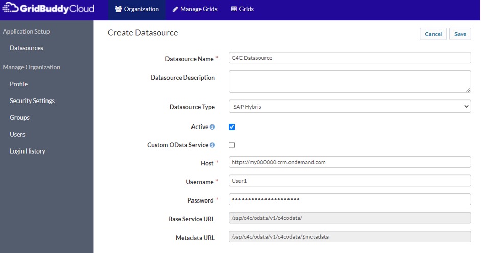
Steps to create a username / passcode (non-SSO) datasources:
- Select “Organization” from the top menu
- Click on “Datasources”
- Click “New”
- From the “Datasource Type” dropdown, select the datasource “SAP Hybris”
- Set a name for the datasource and enable the “Active” checkbox
- Do not enable the “Custom OData Service” or “Use SSO” checkboxes
- Enter a “Host”, “Username” and “Password”
- Click “Save”
Steps to create an SSO-enabled datasource:
In order to configure SSO for a datasource, SSO must be enabled for the GridBuddy Cloud organization and your GridBuddy Cloud user must have SSO enabled. If SSO is not enabled for the GridBuddy Cloud organization, or your user is not SSO enabled,
then the Use SSO checkbox will be disabled. When enabling SSO for your SAP Hybris datasource, you will have to set up SSO in SAP Hybris and will have to complete the OAuth 2.0 Client Registration there as well. Please review the Setting up SSO and OAuth 2.0 Client Registration in SAP Hybris section before
proceeding with the SSO Datasource setup.
- Select “Organization” from the top menu
- Click on “Datasources”
- Click “New”
- From the “Datasource Type” dropdown, select the datasource “SAP Hybris”. Custom OData Services and SSO are currently only supported for SAP Hybris.
- Enable the “Active” checkbox
- Enable the “Use SSO” Checkbox
- Enter a “Host”
- Enter an “Audience Restriction”, “Client ID”, “Client Secret” and “Issuer”. The values will come up from the SAP Hybris system, after you set up the SSO in SAP Hybris and have complete the OAuth 2.0 Client Registration that as well. For
“Audience Restrictions”, the value must match the “Local Service Provider” value located in the Single Sign-On settings for your SAP Hybris system. - Copy the full text of the “X.509 Certificate” text area and create a new plain text .cer file on your local file system using a simple text editor. You will upload this to SAP Hybris for the OAuth 2.0 Client Registration
- Click “Save”

Steps to create a username / password (non-SSO) Custom OData Service:
- Select “Organization” from the top menu
- Click “Datasources”
- Click “New”
- From the “Datasource Type” dropdown, select the datasource “SAP Hybris”. Custom OData Services are currently only supported for SAP Hybris.
- Set a name for the datasource and enable the “Active” checkbox
- Enable the “Custom OData Service” checkbox
- Do not enable the “Use SSO” checkbox
- Enter a “Service URL”, “Username” and “Password”
- Click “Save”

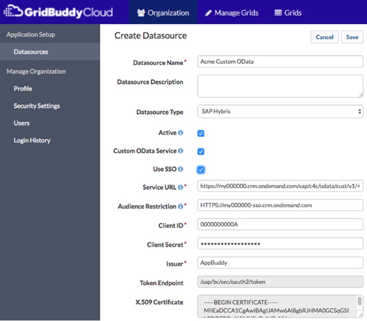
Steps to create an SSO-enabled Custom OData Service:
In order to configure SSO for a Custom OData Service, SSO must be enabled for the GridBuddy Cloud organization and your GridBuddy Cloud user must have SSO enabled. If SSO is not enabled for the GridBuddy Cloud organization, or your user is not
SSO enabled, then the Use SSO checkbox will be disabled. When setting up SSO for SAP Hybris, you will have to set up SSO in SAP Hybris and will have to complete the OAuth 2.0 Client Registration there as well. Please review the Setting up SSO and OAuth 2.0 Client Registration in SAP Hybris section before proceeding with the SSO
Datasource setup.
- Select “Organization” from the top menu
- Click on “Datasources”
- Click “New”

- From the “Datasource Type” dropdown, select the datasource “SAP Hybris”. Custom OData Services and SSO are currently only supported for SAP Hybris.
- Enable the “Active”, “Custom OData Service” and “Use SSO” checkboxes
- Enter a “Service URL”
- Enter an “Audience Restriction”, “Client ID”, “Client Secret” and “Issuer”. Please see the Steps to create an SSO-enabled
datasource section above for additional details regarding these fields. Also, if you have already set up an SSO datasource for a datasource that has a Custom OData Service, then you can reuse the same “Audience Restriction”, “Client
ID”, “Client Secret” and “Issuer” values. In that case, the only thing different for the Custom OData Service will be the “Service URL”. - Click “Save”
Setting up SSO and OAuth 2.0 Client Registration in SAP Hybris
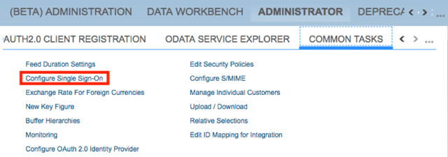
Steps to Configure an OAuth Identity Provider:
- Login to you SAP Hybris C4C instance.
- Select ADMINISTRATION, COMMON TASKS, then Configure OAuth2.0 Identity Provider. If the Configure OAuth 2.0 Identity Provider option is not visible, then please contact your SAP system administrator.
- On the Configure OAuth 2.0 Identity Providers screen, click New OAuth 2.0 Provider.
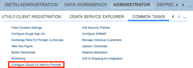
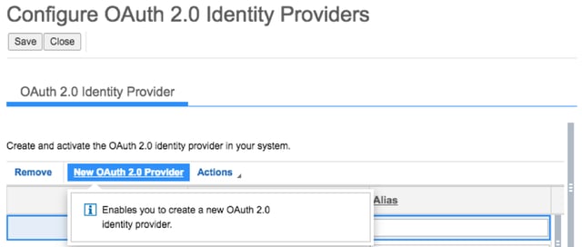
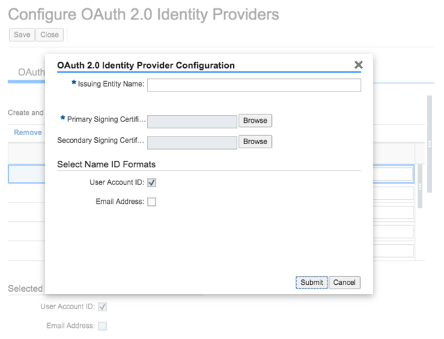
- Set “Issuing Entity Name”
- For the “Primary Signing Certificate”, select the .cer certificate file that you created from the value of the X.509 Certificate from the GridBuddy Cloud datasource screen.
- Set “Select Name ID Formats”
- Click “Submit”
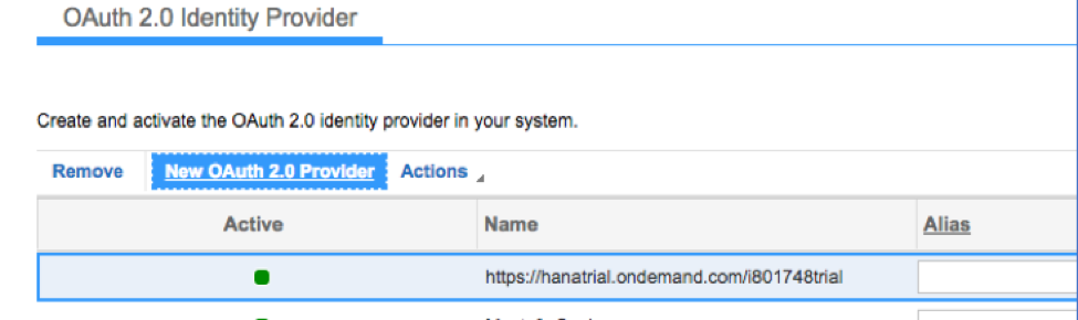
- After successful configuration, OAuth 2.0 Identity Provider should be listed as active.
Steps for Creating an OAuth 2.0 Client
- Login to you SAP Hybris C4C instance.
- Open the OAUTH2.0 CLIENT REGISTRATION tab under ADMINISTRATOR and click on “New”.
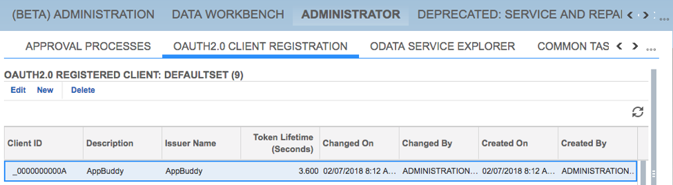
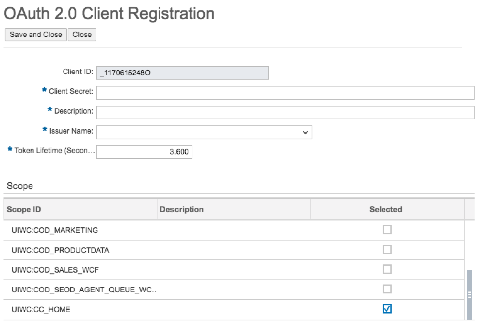
- “Client ID” is automatically generated, save this value to use for setting up the GridBuddy Cloud datasource.
- Enter a value for “Client Secret”, save this value to use for setting up the GridBuddy Cloud datasource.
- Set a “Description”
- Choose the previously defined OAuth 2.0 Identity provider for the “Issuer Name”. If the new Identity Provider doesn’t appear in the list, try logging out and logging back in, after which it should appear in the list.
- Under “Scope”, select UWC:CC_HOME.
- Click “Save”
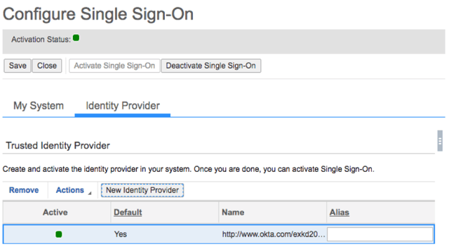
Steps to Configure Single Sign – On
- Configure your IdP accordingly and download the Metadata (see your IdPs documentation for this configuration).
- Login to your SAP Hybris C4C instance.
- Select ADMINISTRATION, COMMON TASKS, then Configure Single Sign-On.
- Select the tab “Identity Provider”, then “New Identity Provider”
- Upload the Metadata from your IdP.
- All your IdPs data will be updated in this screen.
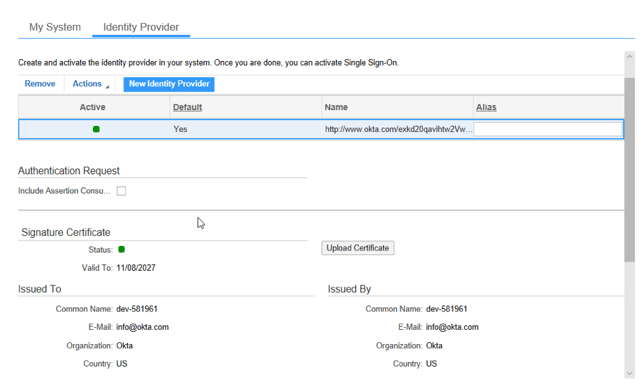
- Click on “Activate Single Sign-On”
- Your sign in data will be listed under “My System”
Creating Grids
Using the Grid Wizard
The Grid Wizard enables users with the “Customize Application” and “View Setup and Configuration” Administrative permissions (set in the user Profile) to determine the objects, records and fields they wish to expose and/or edit within their Grid.
Manage Grids page
The Manage Grids page is where you can create new or delete grids. You can also Manage Extensions and Manage Actions.
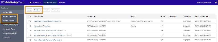
On the Manage Grid Landing page you can choose between the following options:
- Manage Grids: Use the picklist to create a new grid or configure an existing grid. Check the Enable Lightning styles checkbox to apply Lightning styles in GridBuddy Cloud..
- Manage Extensions: Click the link to navigate to the Manage Extensions page where you can create, update and delete extensions for your
grids. - Manage Actions: Click the link to navigate to the Manage Actions page where you can create, update and delete actions.
Deactivate/Reactivate Grids using the Manage Grids view
To deactivate/reactivate grids a user must be logged in as an Organization Admin or a Grid Admin.
Deactivate Grids
- Select “Manage Grids” from the top menu
- Select one or multiple grids to deactivate
- Click “Deactivate”
- Confirm that you would like to deactivate
- Observe the status change to ‘Inactive’
Note – If selected grids have different status (some of them are already inactive), only currently active grids will be deactivated. Once a grid is deactivated it will not appear under the “Grids” tab and will not be accessible to users with the
Grid User role.
Reactivate Grids
- Select “Manage Grids” from the top menu
- Select one or multiple grids to reactivate
- Click “Reactivate”
- Confirm that you would like to reactivate
- Observe the status change to ‘Active’
Note – If selected grids have different status (some of them are already active), only currently inactive grids will be reactivated.
Grid Wizard Buttons and Links
| Button | Description |
|---|---|
| Save | Saves changes on the current page. |
| Next | Saves changes and takes you to the next page. |
| Back | Saves changes and takes you to the previous page. |
| Refresh | Refreshes the page without saving changes. |
Step 1: Create Grid Configuration
Step 1 of the Grid Wizard lets you name a Grid, choose the Grid parent object, specify data management and display options.
Note: changing the Parent Object of an existing grid will delete all the user-defined filter (see User-Defined Filtering) and column settings (see User-defined columns).
| Field | Description |
|---|---|
| Name | Specify a name for the grid. |
| Description | The description of the grid. |
| URL | The direct link URL for the grid. |
| Embedded URL | The Embedded URL for the grid – used for embedding into iframes or Apps. Removes header formatting. |
| Datasource for parent object | The datasource for the parent object as setup under organization settings. |
| Parent object | The primary object for your Grid. |
| Created by | For existing grids, displays the name of the user who created this grid and the date it was created. |
| Last modified by | For existing grids, displays the name of the user who last modified this grid and the date it was modified. |
Data Management
Sets data management permissions.
| Field | Description |
|---|---|
| Edit | Make this grid editable vs.read-only. |
| Create | Enable inline creates. |
| Roll back on save | Disallow partial saves on record fail. If one record fails, roll back all records to the last saved state. |
| Mass update | Enable mass update. |
| User-defined filtering | Users can define their own filter conditions. |
| User-defined columns | Users can define their own column order and/or hide columns. |
Display
Specify display options that the grid will launch with by default.
| Field | Description |
|---|---|
| Records per page | The number of parent records per page. |
| Related object options |
|
Extensions
| Field | Description |
|---|---|
| Choose Extensions | Choose extensions for the grid by clicking the green “+” icon. Order extensions by dragging them within the selected code section. Remove extensions from the grid by clicking the red “-” icon. Note, global CSS and global JavaScript will appear in the selected code section for all grids and cannot be removed or reordered. |
Step 2: Select Fields & Formatting
In Step 2 of the Grid Wizard, you can specify the fields, conditional formatting and actions that should display on the grid.
In the Select Fields section, the Choose an Object section shows you the parent object for the Grid and its related child objects. Newly created grids will automatically add the Name (or similar) field to your grid, which will be
displayed in the Selected Fields section.
Search for objects using the search box at the top of the Choose Object section.
- Click an object name to see its fields in the Choose Fields section.
- Search for fields using the search box at the top of the Choose Fields section.
- Select fields in the Choose Fields section by clicking the green “+” icon next to the field name. Added fields will appear in the Selected Fields section.
- Deselect fields by clicking the red “-” icon next to the field name in the Selected Fields section.
- Order fields by dragging them within the Selected Fields section.
- Click the Show field API names link to see API names next to the field labels. Click Hide field API names to hide the API names.
Note:Removing a child object on an existing grid will delete all the user-defined filter(see User-Defined Filtering) and column settings (see User-defined columns).
Object Cross-Referencing
Cross-reference data from objects from other datasources or from objects that don’t have a relationship with the parent object at the schema level:
- A section named Additional Objects in the Select Fields section – this lists all GridBuddy Cloud-compatible objects, based upon datasource, available, and they may or may not be related the parent object.
- Select the Datasource as configured in Organization->Datasources. This will show the list of available objects for that datasource. Grids can have multiple datasources related to the parent object.
Indirectly related objects can be associated in GridBuddy Cloud in two ways:
- Map the objects to a common field. For example, setup a grid of Accounts and Opportunities, matching the Opportunity records from a 2nd datasource by the Account Name field to the Account’s Account Name field. The Account and
Opportunity being from different datasource are not natively connected, but through Object Cross-Referencing users can work with them together.

Page 2 of the Grid Wizard showing a grid additional objects from a 2nd datasource with Account as the parent object and Opportunity from the second datasource as a
child. If a Opportunity has the same Account Name as the Account records Account Name will display as related to that Account on this grid.
To set this up:
- Choose a datasource and object from the Additional Objects section in the first pane. (This can be the same or different datasource)
- Choose the fields for the grid.
- A new section for that object will appear in the Selected Fields section along with a mapping widget, where you specify the fields that map the parent to this object. The mapped fields should be of similar data types.
- Or use a related object. For example, setup a grid of Accounts with the Opportunities object that is a related object.

Page 2 of the Grid Wizard showing a grid with Account as the parent object and Opportunity as a children. If an Account has related Opportunity Members, either the
Opportunities related to the Account will display as related to the Account on this grid.
To set this up:
- Choose a related object from the Related section in the first pane.
- Choose the fields for the grid.
- The relationship between the parent and child objects is setup automatically
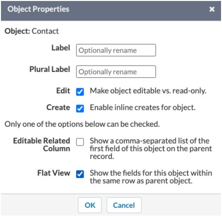
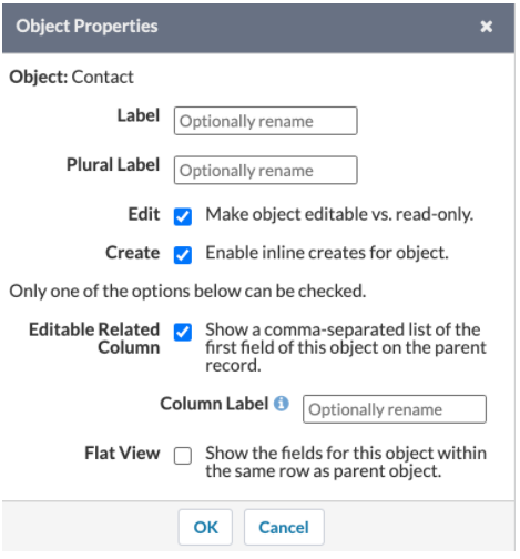
Object PropertiesYou can customize settings for individual objects on the grid. To access these settings, click the ellipsis icon next to the object’s name.
|
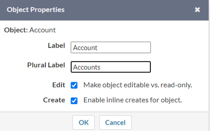 The Object The Objectproperties widget open for the Opportunity object on page 2 of the Grid Wizard. |
Flat View
Specify whether the fields for this object should show within the same row as the parent object. This option is only available for child objects. Read more here.
Flat Views of Child Records
To make your grids leaner, you can set up flat views. This will bring data from related objects up to the parent level. Flat views are alternatives to the hierarchical views of child data.
Flat view displays child object fields within the same row as the parent object. For example, you can create a grid of Opportunities and show Opportunity Products within the same row as the Opportunities. If an Opportunity record has multiple Opportunity Product records, then the Opportunity data will be repeated for each child record. Editing a parent record that has duplicates on the grid will propagate the edits to all duplicates. If a parent record does not have any child data, then the cells will be empty in the child object’s columns.
Click the New button at the top of the grid to create a parent record and flat view child record simultaneously. Required fields that are not on the grid will be appended to the end of the new row for parent and flat view child. If you only enter data in parent fields and save, then only a parent record will be saved (i.e. required fields of the child object will be ignored if none of the child fields have data entered in them). Note, create new is not available for “other side of the junction” objects. If an “other side of the junction” object is configured for flat view, and you click the New button at the top of the grid, the cells for the flat view object will be empty.
Editable Related Columns
Streamline your multi-object grids: bring your related records up as a new column on the parent to create a multi-object experience on a single row. Click on the new column to see the entire child section, only when you want to see it.
Field PropertiesYou can customize how a field appears on the grid by defining the following field properties: label, read-only, and required. To access custom field properties, click the ellipsis
|
The Field Properties widget open for the Opportunity Name field on page 2 of the Grid Wizard. | |||||||||||||||||||||||||||
Data CardsEnable the Data Card feature to configure Primary Fields, which always appear on grids, and Data Card Fields, which are hidden initially, and accessible by clicking the Data Card icon in a grid row. To enable this feature, click Drag and drop to move a field from the Primary Fields section to the Data Card Fields section. Note that one primary field is required for all objects. When enabling Data Cards, the first seven fields stay in the Primary Fields list, and the others are automatically moved to the Data Card Fields section. When selecting additional fields, if there are already seven fields in the See how Data Cards look in a grid under the Data Card section. Note, Column Width and Summary Type in the Field Properties widget are disabled for Data Card fields. |
 Data Cards enabled for the Account object Data Cards enabled for the Account objecton page 2 of the Grid Wizard. |
Conditional Formatting
Create conditional formatting rules to format a field based on a condition. The rules are evaluated real-time, so you’ll see your data changes when you update your grid even before you save it. Click the info icon ( ) at the top center next to the object name to see what rules are applied to your grid (see screenshot below).
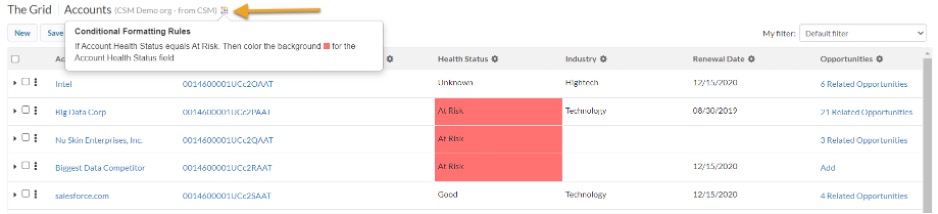
Conditional formatting on the Grid. The formatting rules panel is open at the top center side of the grid next to the object name.
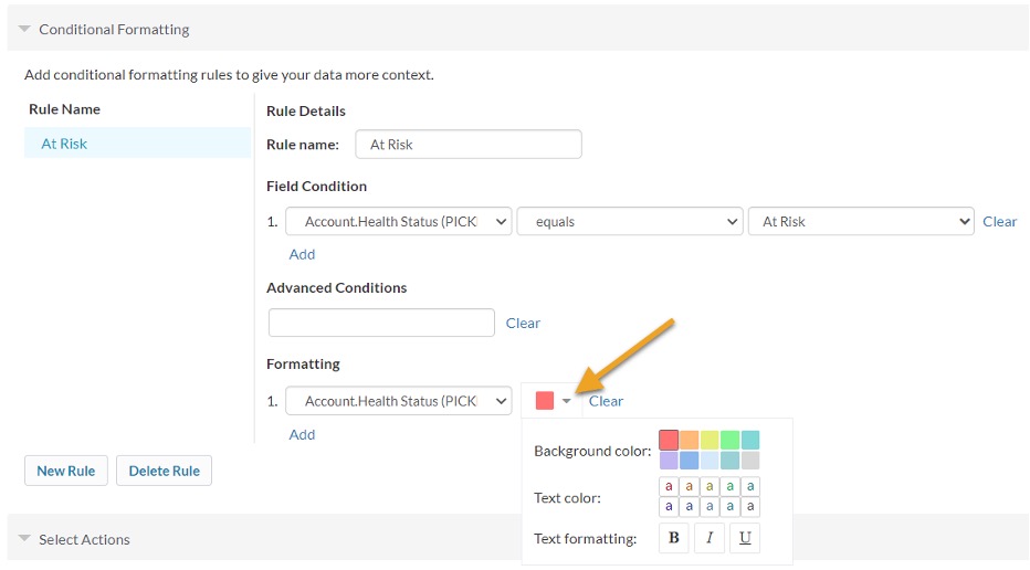
Conditional Formatting rules are configured on page 2 of the Grid Wizard in the Conditional Formatting section.
There are 3 ways to format a field or row:
- Format a field based on its value. For this, select the same field in both field dropdowns.
- Format a field based on another field’s value. To do this, select the field to evaluate in the first dropdown and the field to format in the second dropdown.
- Format an entire row based on a field’s value. To do this, check the “entire row” checkbox.
Fields:
- Rule name: Give your rule a name that describes the rule.
- Field Condition:
- Evaluated field: We’ll evaluate this field’s value to see if we need to apply the formatting specified. Supported data types are: Boolean, Currency, Date, Date Time, Double, Formula, Integer, Percent, Picklist, String, and Text area.
- Operator: Define a logical operator for the evaluation of the selected field.
- Value: We’ll evaluate against this value to determine to apply the rule or not.
- Add: Add another field condition to your grid for more specific filtering
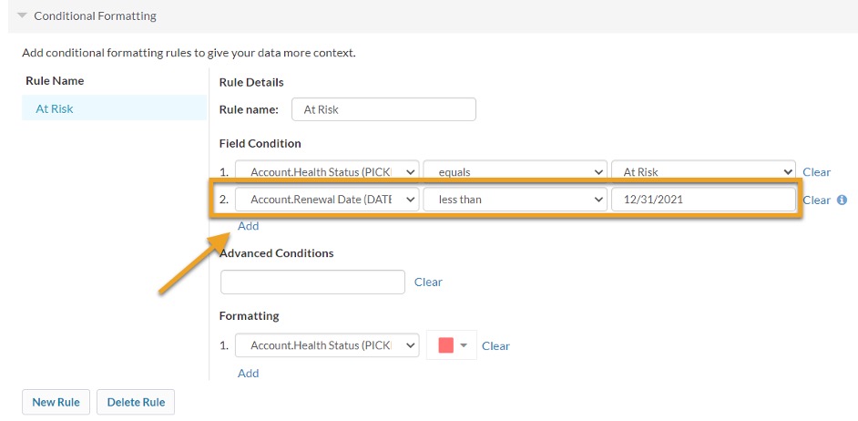
- Advanced Conditions:Optional, alter the combination of field conditions with AND and OR operators.
- For example: 1 AND 2 AND (3 OR 4)
- Formatting:: We’ll evaluate against this value to determine to apply the rule or not.
- Entire row: Optional, select this to apply the formatting to the entire row.
- Formatted field: Optional, pick a field to apply the formatting to. The default is the evaluated field, but it can be any other field on the same object.

- Background color:Optional, pick a color to apply as the background color.
- Text formatting:Optional, select one or more text formatting options.
Popular Examples:
- If the Opportunity Amount is greater than 1000 set the background color to green.
- If the Account Rating equals Hot, set the background color to red for the entire row.
- If the Task Due Date is less than a specific date, color the Task Name blue.
When creating a rule on a Date or Date Time field, you can use these relative dates for the value:
- THIS_QUARTER
- NEXT_QUARTER
- LAST_QUARTER
- THIS_YEAR
- LAST_YEAR
- TODAY
- TOMORROW
- YESTERDAY
- THIS_WEEK
- THIS_MONTH
- LAST_MONTH
- NEXT_MONTH
- LAST_90_DAYS
- NEXT_90_DAYS
- LAST_N_DAYS:n
- NEXT_N_DAYS:n
- LAST_WEEK
- NEXT_WEEK
- LAST_N_WEEKS:n
- NEXT_N_WEEKS:n
- LAST_N_MONTHS:n
- NEXT_N_MONTHS:n
- NEXT_YEAR
- LAST_N_YEARS:n
- NEXT_N_YEARS:n
- LAST_N_QUARTERS:n
- NEXT_N_QUARTERS:n
- N_DAYS_AGO
- N_WEEKS_AGO
- N_MONTHS_AGO
- N_QUARTERS_AGO
- N_YEARS_AGO
- N_FISCAL_QUARTERS_AGO
- N_FISCAL_YEARS_AGO
- THIS_FISCAL_QUARTER
- LAST_FISCAL_QUARTER
- NEXT_FISCAL_QUARTER
- NEXT_N_FISCAL_QUARTERS:n
- LAST_N_FISCAL_QUARTERS:n
- THIS_FISCAL_YEAR
- LAST_FISCAL_YEAR
- NEXT_FISCAL_YEAR
- NEXT_N_FISCAL_YEARS:n
- LAST_N_FISCAL_YEARS:n
For a Salesforce datasource, the below fiscal relative dates will pull the custom fiscal calendar configured in their Salesforce org.
For a Dynamics and SAP datasource, they will default to US fiscal year start and end dates.
- THIS_FISCAL_QUARTER
- LAST_FISCAL_QUARTER
- NEXT_FISCAL_QUARTER
- NEXT_N_FISCAL_QUARTERS:n
- LAST_N_FISCAL_QUARTERS:n
- THIS_FISCAL_YEAR
- LAST_FISCAL_YEAR
- NEXT_FISCAL_YEAR
- NEXT_N_FISCAL_YEARS:n
- LAST_N_FISCAL_YEARS:n
Actions
In the Select Actions section, select one or more actions you want to enable on the grid. The actions displayed are associated to the objects you have selected and saved in the above Select Fields section. To
define actions click the Manage Actions link or button.
Step 3: Define Grid Filters
Use Step 3 to filter the data that is shown in your Grid and to order your Grid results. You can apply filter and ordering conditions to each object that you selected fields for in Step 2.
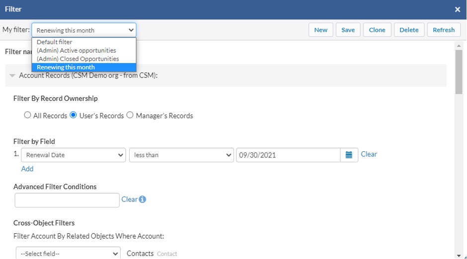
Filtering: Admin-Defined Filters
Multiple filters can be saved in Step 3. Each filter that is saved will be available for selection by grid users.

Saved Filters picklist on step 3 of the Grid Wizard displaying the default and saved filters.
Each grid has a default filter that is created automatically. The default filter can be updated and cloned, but not deleted. The default filter will appear as “Default filter” in the My Filter picklist on the grid. Any other filters saved on Step 3 will appear with the “(Admin)” prefix in the My Filter picklist. Note, the filters saved on Step 3 will still show in the My Filter picklist on the grid even if User-Defined Filtering is not enabled for the grid.
To create additional filters, you can create new or clone:
- To create new, select “Create New Filter” from the “Saved filters” list. Make any changes and click “Save” to save your new filter. Note, filters cannot be named “Default” or “Default filter”.
- To clone, click the “Clone” button to clone the currently selected filter. The filter widget will reload and the name of the filter will be defaulted to “Copy of + [filter name]”.
To edit a filter, select the filter from the “Saved filter” drop down, make any changes and save. To delete a filter, select the filter from the filter dropdown then click the “Delete” button. Note, the default
filter cannot be deleted.
Note: All the admin-defined saved filters of a grid are deleted when certain grid configuration changes are made, including:
- Changing the grid’s parent object on page 1 of the Grid Wizard.
- Removing child objects on page 2 of the Grid Wizard.
Record Ownership
Specify whether the Grid will display all records or only the records the current user owns.
For SAP objects:
- Account
- Opportunity
- ServiceRequest
For SALESFORCE objects :
The Grid will display all records, records the current user owns or records where the user is the record Owner’s Manager.
Note: Filtering on the Owner. Manager field can also be applied in the Filter by Field section.
Manager filter
Filter by All records, User’s records, or Manager’s Records. When User’s records is selected, the grid will display records where the current user is the record owner. If Manager’s records is selected, the grid will display records where the current user is the Owner’s Manager. The Manager is specified in Setup under the User detail.

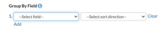
Group By
Grids can now be grouped by fields to easily visualize which records have certain values. Groupings are configured on page 3 of the Grid Wizard. Aggregations can also be configured to display within groupings. For example, you can group an Opportunity grid by Account Name and Stage, and show the sum of the Opportunity Amount for each group. Read more about configuring group by fields and aggregations, and groupings on the grid.
If you apply grouping to a grid, you will have the ability to expand and collapse groups by sections on the grid. This can also be configured on page 1 of the Grid Wizard.
In orgs that have multi-currency enabled, if a grid has group by enabled, and has aggregated currency fields, and all records on the visible page have the same currency, then aggregate values will be shown in the currency of the records on the page, rather than the org’s corporate currency
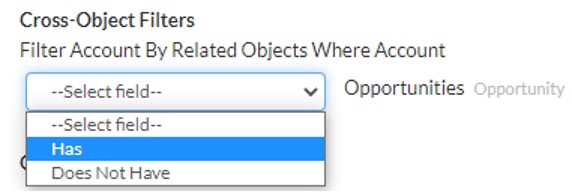
Cross-Object Filters
Cross-object filters for Salesforce Datasource can be configured on page 3 of the Grid Wizard. Filter your parent object by the related objects in your grid. For example, on an Opportunity grid, create a filter to show opportunity records that have or do not have related products.
Filter by Field
Select up to 10 Filter by Field conditions. Enter a value in the input text box to indicate the filter condition. A blank value in the input text box denotes that the condition will evaluate for a null value.
Below is a list of all available operators and a description of the conditions they check for. Some operators are not available for all field data types.
| Operator | Description |
|---|---|
| equals | Field value exactly matches criteria. |
| not equal to | Field value does not match criteria. |
| starts with | Field value starts with the characters entered in the criteria field. |
| contains | Field value contains any of the characters specified in any of the comma-separated values provided in the criteria field. Multiple comma-separated values are supported for SAP and Salesforce text, and ID field types. |
| does not contain | Field value does not contain any of the characters specified in the criteria field. |
| less than | Field value is less than the value of the criteria field. |
| greater than | Field value is greater than the value of the criteria field. |
| less or equal | Field value is less than or equal to the value of the criteria field. |
| greater or equal | Field value is greater than or equal to the value of the criteria field. |
| includes | Field value equals any of the comma-separated values specified in the criteria field. Multiple comma-separated values are supported for SAP and Salesforce numeric, text, and ID field types. |
| excludes | Field value excludes the value specified in the criteria field. |
For all text-based data types, the operators are not case sensitive.
By default, filter conditions will be evaluated together with a boolean “AND” operator. For example, if three filter conditions are specified they will be evaluated as (1 AND 2 AND 3). See the Advanced Filter Conditions section below to specify other boolean conditions.
Fields that are picklists, record types, or booleans will have their values accessible by clicking an arrow in the filter value input. You can also begin typing in the input to see matching values.
GridBuddy supports the following relative date filters that apply to both Date and Date Time fields.
| TODAY | |
| THIS_QUARTER | |
| LAST_QUARTER | |
| NEXT_QUARTER | |
| THIS_YEAR | |
| LAST_YEAR |
Advanced Filter Conditions
Write conditions using “AND”, “OR” and “NOT”. If you specify an Advanced Filter Condition for an object, you must include numbers for all the Filter by Field conditions you added.
Use the following tips when entering filter logic:
- Use the line numbers at the beginning of each filter by field line to represent it in the advanced filter Boolean expression, and separate each line number with AND, OR, or NOT to specify the conditions a record must meet to be included. Use
the AND operator to find records that match both values, use the OR operator to find records that match either value, and use the NOT operator to find records that exclude values. Use filter logic to specify the relationship between each
filter line. Avoid conditions like “1 AND OR 2” or “(1 2 3).” - When you add advanced filter logic, include each filter by field condition in the Boolean expression to avoid an error.
- Make sure all parentheses are closed.
- Enclose conditions that have priority in parentheses. For example, “(1 AND 2) OR 3” finds records that meet either both the first two filters or the third. While “1 AND (2 OR 3)” finds records that meet the first filter as well as either the
second or third. - If you specify filter logic, then add another filter by field condition, you must include that condition in your advanced filter logic. Likewise if you remove a filter by field condition, remove the corresponding number from the filter logic
to avoid an input error. - Begin a condition with the term NOT but do not end one with NOT. For example, “(NOT 1) AND (2 OR 3 OR 4)” finds records that meet any of the last three filters and excludes records that meet the first filter in Salesforce.
- Please note the condition will be different if using SAP Hybris C4C. For example, “NOT (1) AND (2 OR 3 OR 4)” finds records that meet any of the last three filters and excludes records that meet the first filter.
Here are some examples to help guide you when entering filter logic:
| Example | Description |
|---|---|
| (1 AND 2) OR 3 | Finds records that match both the first two filter lines or the third. Use the following filter conditions:
This filter can help you find banking accounts owned by Joe or any account with a revenue greater than $10 million. |
| 1 AND (2 OR 3) | Finds records that match both the first filter line and either of the last two.Using the same filters in the example above, this grid finds all accounts Joe owns that are either in the banking industry or have a revenue greater than $10 million. You can also repeat a filter line in your expression. For example, the expression in this example yields the same results as (1 AND 2) OR (1 AND 3). |
| (1 AND 2) OR (3 AND 4) | Finds records that match both the first two filter lines or the second two filter lines. This could be useful when compiling a list of key deals that are closing soon. Use this expression with the filters below to find all the opportunities over $1 million that are closing in the next 60 days as well as opportunities over $5 million that are closing in the next 120 days. In this example, your filters would look like this:
|
| (1 AND (2 OR 3)) OR 4 | Finds records that match the last filter line as well as those that match the first and either the second or third filter line.For example, using the filter conditions in the first example above, if the last filter line is “Account Owner contains Susan”, then this grid finds all accounts Joe owns that are either in the banking industry or have a revenue greater than $10 million, or all the accounts that Susan owns. |
Sort by Field
Select a field that the Grid object will be sorted by and whether it will be sorted in ascending or descending order.
To sort by multiple fields, click the Add link at the bottom of this section, and select additional fields and their sort orders. You can specify up to 5 sort conditions. Each sort condition is applied in the numbered order you specify. For
example, sort order condition 1 will be applied to your results before sort order condition 2, and so on.
Note, if a user sorts by clicking on a gear icon on a column heading, it will override any sort conditions applied here.
Set Max Record Limit
Set the maximum number of total records that will display for that object on the Grid. Note, this may be different from the number of records shown per page. See the Pagination section under Using Grids for more detail.
Manage Actions
Actions are processes that run against your data. They can also be links to records, for example, in Salesforce pages, GridBuddy Cloud grids, or external URLs or processes.
GridBuddy Cloud actions are defined on the Manage Actions page, enabled on the Select Fields page of the Grid wizard and launched from the GridBuddy Cloud grid.
Create New Actions
Actions are created from the Manage Grids-> Manage Actions page. To create a new action, simply click the “New” button and fill in the action details:
- Enter the Action Name, a free form field that labels the action.
- Choose the action Type. If the action applies to only one record at a time, choose the “Single Record” option. If the action applies to a set of records, choose “Batch”. If the action does not rely on any grid records, choose
“Global”. An example of a Global action would be a link to a Salesforce report. - Choose Datasource. This is the datasource for the selected Object.
- Choose an Object, which can be an standard or supported custom object from the Datasource. Any grid that includes this object will have this action enabled for it on page 2 of the Grid Wizard.
- The Location field will be displayed if the action is type Batch or Global. Location has two options: Menu and Button. The Location configuration field lets you customize whether this action will appear on the grid under the
“More” menu or as a button at the top of the page. - Display Behavior indicates if the action should be launched in a new window/tab, a popup window overlay, the grid window, or displayed as a grid overlay.
- The URL that will be launched upon execution of the action. Should be an absolute URL starting with http or relative URL starting with /. Relative URLs can only link to grids within GridBuddy Cloud.
- Name of the ID Parameter to be persisted to the url. For example, you would input ‘recordId’ if you defined a ‘Single Record’ type action and the endpoint url expects a parameter named ‘recordId’. GridBuddy Cloud will persist
‘recordId=<id of the record where the action was launched>’ to the url. For most cases, this may simply be ‘id’. - The Confirm Action option lets you enable a confirmation dialog before performing this action.
- If Confirm Action is enabled, the Confirmation Message field allows you to customize the message in the confirmation dialog.
Now click the “Save” button to save your new action. You can also create and edit multiple actions at the same time, and then click Save once.
Click the minus icon to the left of the new action name to remove it.
Delete Actions
You can delete existing actions by selecting the checkbox next to one or more action names and clicking the “Delete” button. When an action is deleted, it is also removed from the associated grids.
Manage Extensions
Create JavaScript and CSS code on the Manage Extensions page from the Manage Grids tab. This code can then be added to individual grids, or added to all grids globally.
Create New Extensions
Click the New button at the top of the page. In the Extension Details section, enter a Extension Name, choose the Type, and enter the Code Body. You can create multiple extensions and save them all at once by clicking the Save button. extensions
with the Type “Global JavaScript” or “Global CSS” will be applied to all grids in the Salesforce org, whether they exist today or will be created in the future. extensions with the type “JavaScript” or “CSS” can be applied to specific grids by
selecting them in the extensions section on page 1 of the Grid Wizard.
Modify Existing Extensions
Click on an extension name to see its details. In the Extension Details section, edit the Extension Name, Type, or Code Body. You can edit multiple extensions and save them all at once by clicking the Save button.
Delete Extensions
Check the box next to an extension name and click the Delete button. You can select multiple extensions and delete them all at once by clicking the Delete button.
Custom CSS Example
.header-row td { background-color: #2baced !important; }You can find color codes here: https://www.w3schools.com/cssref/css_colors.asp
.child-row th { background-color: #d1d2d3 !important; }or
.child-row th { background-color: azure !important; }
To color a header by datasource you need to know the data source ID. This is the 32 character number like this: “3C97EA7A-97C2-483A-AD37-
.grid–wrapper .grid[ds-id=”3C97EA7A-97C2-
.grid–wrapper .grid[ds-id=”3C97EA7A-97C2-
background: lightblue !important;
color: black !important; }
To update both the header and the data row:
/* Header */
.grid-wrapper .grid[ds-id=”3C97EA7A-97C2-
.grid-wrapper .grid[ds-id=”3C97EA7A-97C2-
border: 3px
solid lightgreen;
}
/* Data row */
.grid-wrapper .grid[ds-id=”3C97EA7A-97C2-
border: 3px solid lightgreen;
}
Grid Access
Once a Grid has been configured, users can access it from the “Grids” tab or by using the embedded link. Embedded links are used to embed a grid in another page. For example in another web page as an iFrame, in a Salesforce Visualforce page, or in
a SAP Hybris C4C mashup.
Grid URL Parameters
Most methods of providing access to a Grid require you to generate a Grid URL. A simple version of the Grid URL is generated for you on page 1 of the Grid Wizard. Below are some URL parameters that the Grid supports. Including these parameters
provides more control over how a Grid initially loads.
| Parameter | Description |
|---|---|
| ea | “Expand All” option. A value of 1 shows all child related lists expanded by default. A value of show_related_objects shows all child related lists collapsed by default. A value of 0 hides all child related lists by default. Passing a list of object API names shows just those child related lists expanded by default, i.e. ea=Contact,Opportunity. This parameter only applies to multi-object grids. |
| fpf | “Filter by Parent Field” option. Specify the API name of a field on the grid parent object. Note, filter conditions defined in Grid Wizard 3 and in the user-defined filter widget will be applied in addition to the criteria specified by the fpf/fpv parameters. This parameter is only supported for fields with the following data types: id, lookup, text, picklist, email, URL, phone, boolean, date (literal (SAP only) and relative), and datetime (using relative dates). |
| fpf2-fpf5 | Additional “Filter by Parent Field” options. These can be added to grid URLs to filter grids further.
For example: fpf=Stage&fpf2=CloseDate&fpf3=ForecastCategoryName&fpf4=LeadSource&fpf5=Type. |
| fpv | “Filter by Parent Value” option. The value that the fpf parameter should evaluate to. Records that have this value for the fpf field will be displayed on the grid. Note, filter conditions defined in Grid Wizard 3 and in the user-defined filter widget will be applied in addition to the criteria specified by the fpf/fpv parameters.
Examples of filtering: |
| fpv2-fpv5 | Additional “Filter by Parent Value” options.
Example of filtering by Opportunity Close Date to show Opportunities closing this quarter with a Lead Source of Web: |
| recordid | Specify the ID of the parent record you want to filter child results by Detail Page Related Lists. This ID must be a valid Salesforce record ID matching the object type of the parent object you defined in page 1 of the Grid Wizard. When this parameter is specified, the “ea” parameter is automatically set to 1 and the “sh” and “ssb” parameter are automatically set to 0, expanding all records, and hiding the header and sidebar. |
Examples: https://gridbuddycloud.com/grid/embed/E5AD7390-DC70-4E39-94DE-62F38E164B30?ea=1
The URL above loads a Grid and will automatically expand all child records on load
https://gridbuddycloud.com/grid/embed/E5AD7390-DC70-4E39-94DE-62F38E164B30?recordid=0015000000HtRNX
The URL above only loads a grid with records with an ID of 0015000000HtRNX.
Using Grids
In order to view or edit a Grid, you must access it via:
- Grid tab from gridbuddycloud.com
- URL as outlined in Grid Wizard Configuration page
- Embedded in another page, for example, using an iframe using the Embed URL from the Grid Wizard Configuration page
Managing Grid Data
Based on the Grid configuration, the Grid may open by default in read-only or edit mode. If it’s in read-only mode and the configuration allows for editing, an “Edit” or “New / Edit” button will appear. The user will be able to edit fields based
on their profile permissions.
While the Grid is in edit mode, the buttons “Save” and “Read Only” will appear. The “Save & Return” option will appear in the More menu. “Save” saves your changes
to the Grid data. “Save & Return” saves your changes and takes you back to the read-only Grid. “Read Only” takes you back to the read-only Grid. “Refresh” refreshes the Grid.
Once you make changes to fields on the grid, the modified fields will show an orange background until it is saved successfully.
Grid Actions
Actions appear in three places on the grid: on the record level, in the More menu or as a button. Actions are crated from the Manage Grid->Manage Actions Page and enabled for each grid on the Grid Wizard Select Fields page.
|
Record Actions Single Record custom actions (3) associated to this object will appear below the standard GridBuddy Cloud actions. Clicking on the action will invoke it for the record you selected it from. Global Actions
Global actions can appear as a button (4) or as a global action in the “More” dropdown (5)
|
 |
If the action has an upward arrow icon, it will be launched in a new window. If the action has a “grid” icon, it will be launched as a grid overlay:
Grid overlay launched from an Account record to show a list of Opportunity records.
The top bar of the grid overlay has a few useful links.
- Next to the action name (“List SF Opportunities” in the example above), there’s an icon (1) that will open the action in a new window.
- On the right, the “close & refresh” link (2) will close the overlay and refresh the grid. This is helpful when the data you’re working with in the overlay affects the data in the original grid.
- The “close” link (3) will simply close the overlay.
“More” Menu
The More menu includes some of the less common actions GridBuddy Cloud ships with (all of which are configurable), as well as Batch and Global custom actions associated to this grid:
- (1) Grid Wizard links
- Edit Settings: opens page 1, Configuration, of the Grid Wizard
- Edit Fields: opens page 2, Select Fields, of the Grid Wizard
- Edit Admin Filters: opens page 3, Define Filters, of the Grid Wizard
- (2) Standard grid functions
- Mass Create:quickly create multiple object records with parent or related object rows within your grid
- Export:export grid data in CSV or XLS file formats
- (2) Standard grid actions
- (3) Custom/global grid actions
- Search the Web: this is an example of a custom action
More menu open on a grid showing standard and custom actions.
Action Buttons
Batch and Global actions can also be customized to display as buttons instead of menu items in the More menu. These buttons will appear at the top of the page next to the other grid buttons.
“Show…” Menu
The Show menu appears on multi-object Grids. This menu allows you to expand and collapse child object sections.
- Toggling the “Related objects” checkbox will show or hide the related object sections.
- Toggling the “Related records” checkbox will expand or collapse all related records.
- Toggle the object record checkboxes, e.g. “Opportunity” or “Contacts”, will expand or collapse related records of that object type across parent records.
The settings in the Show menu can be configured on page 1, Configuration, of the Grid Wizard. See the Display section for more information.
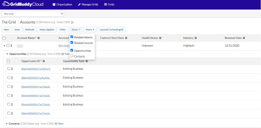
Show menu open on a Grid of Accounts, Opportunities, Contacts, and Leads. Leads and Contacts are collapsed.
Viewing Child Records
If the Grid contains child objects, child object records will be displayed under the parent object record. If child data does not exist for a particular parent record, the child object section will be displayed and the text, “No records found,”
will be displayed. Show or hide all child objects for a particular parent record by clicking the arrow icon at the far left of the parent row. Expand or collapse a child object section by clicking the arrow icon next to the object name. Use the
Show menu at the top of the page to show or hide all child object sections, or to expand or collapse child object sections. See the Show menu section for more information.
Editing Child Records
If you have a grid configured with cross-referenced objects, there’s a possibility that one or more child records will match multiple parent records. In this case, GridBuddy Cloud will show the relevant records under each parent record,
duplicating the child records where necessary.
If duplicate child records are present, and the cross-referenced child object was setup using mapped fields on page 2 of the Grid Wizard, then GridBuddy Cloud will synchronize the changes you make across any child record that has duplicates. For
example, if you have a grid where Contact is the parent, and Lead is the child, and multiple Lead records match multiple Contact parent records, then editing one Lead record will automatically show edits for the other duplicated Lead records,
where those Lead records appear under other Contact parent records.
Creating New Records
In “New / Edit” mode, users can create new records for objects on the grid if:
- “Create” was checked on the first page of the Grid Wizard.
- “Create” was not unchecked in the Object
Properties popup for that object on the second page of the Grid Wizard. - The user’s profile permissions allow for the creation of new records for that datasource’s object.
If all the above conditions are satisfied, the New button will appear under the grid name in the grid header. Click this link for as many new rows as you want to create for that object. You will see new rows appear under the object header
highlighted in orange. If you did not include all required fields for that object in the Grid, GridBuddy Cloud will append the remaining required fields to the end of the row so you can include values for them to save successfully.
Enter the data for the new rows. If you include a value for at least one field in a new row, GridBuddy Cloud will not allow you to save the record unless you fill in all the required fields. If you leave all the fields in a new row blank, they
will be ignored when you hit the Save button. If you want to exclude a new row you created from the Save operation, simply click the minus sign on the left side of the row.
GridBuddy Cloud will do its best to pre-populate fields in new rows with default values if default values are defined. This includes fields with the following field types: checkbox, currency, date, date time, email, number, percent, phone,
picklist, multi picklist, text, text area, text area (long), and URL. However, there are known Salesforce limitations that prevent GridBuddy Cloud from showing default values in all cases. Default values are not pre-populated for picklists that
have “Restrict picklist to the values defined in the value set” checked.
To create child rows under a parent record, first expand the child section for the parent record. A section will appear for all creatable child objects defined on the Grid. Each child object name in the child object section will have a New link next to it. Follow the instructions above to create new children with the New link.
Note, you can also edit existing records on a Grid at the same time you create new records.
Mass Update Records
If the “Enable mass updates” option is selected on page 1 of the Grid Wizard, the “Mass Update” button will appear on the grid. Click the “Mass Update” button to open the mass update widget which will enable you to specify a value for a field on
any object on the Grid and apply that value to multiple records.
Fill in the values for the fields you want to mass update in the widget. Once you click on a widget field, it will turn orange indicating that the field value will be used to mass update corresponding fields in the Grid (even if the widget field
value is blank). Click the “Clear” link next to the field to clear the widget field value and specify the field will not be mass updated in the Grid.
Apply to selected records by selecting one or more existing records on the Grid using the checkbox to the far left of row. You can select/deselect multiple records for a particular object by clicking the checkbox in the header row
for that object or by holding the Shift key while clicking. Click the “Apply to Selected Records” button to apply the values to each selected row.
Apply to all records by clicking on the “Apply to All Records” button. Only objects corresponding to widget fields you specified values for will be updated in the Grid.
Finalize your changes by clicking the “Save” button on the Grid.
Saving Records
After you are done creating new/editing existing records, hit the Save button to save and continue editing after save. If the save is successful, you will see a confirmation message when the page refreshes. Any save errors will show at the top of
the screen with the grid in edit mode, and the records that caused the error will be highlighted in the grid unless otherwise noted in the error message. If your save was not successful, GridBuddy Cloud will display the edits you made, allowing
you to update the error-related fields without having to remember and re-enter all your changes.
If “Roll back on save” was selected for the object, no edited or newly created records will be saved if a save error occurs. Otherwise, GridBuddy Cloud will save all edited and newly created records that did not cause an error on save.
If your save was successful and you do not see the records you created or edited appear on the Grid, ensure that the newly created or edited record falls within the filter criteria for that Grid or that it is not showing up on a different Grid
page because it is being sorted according to the sort condition specified in page 3 of the Grid Wizard.
User-Defined Filtering
When “Users can define their own filter conditions” option is selected on page 1, Configuration, of the Grid Wizard, this enables several filter options for grid users: the Filter Widget, Field Actions, and Quick Filters. Each of these filter
options is described below.
Filter Widget
If the “Users can define their own filter conditions” option is selected on page 1, Configuration, of the Grid Wizard, the “Filter” button will appear on the grid. Click the “Filter” button to open the filter widget which will enable a user to
specify alternative filter conditions for this grid. These filter conditions will only be applied for the user that specifies them, i.e., other users’ grids will not be affected by conditions specified in this widget.
Please follow the instructions in the Step 3: Define Grid Filters section for how to specify the various options that appear in this widget.
Filter widget with saved filter options expanded
Save your changes by clicking the “Save” button on the filter widget. The filter definition will save, and the grid will automatically reload with the new definition. This definition will be persisted and applied
for the current user until the user modifies it again.
To create additional filters, you can create new or clone:
- To create new, open the filter widget and select “Create New…” in the filter picklist at the top. The widget will be loaded with the default filter definition that was defined in page 3 of the Grid Wizard. Make any changes
and click “Save” to save your new filter. Note, filters cannot be named “Default” or “(Default filter)”. - To clone, click the “Clone” button to clone the currently selected filter. The filter widget will reload and the name of the filter will be defaulted to “Copy of + [filter name]”.
To edit a filter, select the filter from the filter drop down, make any changes and save.
To delete a filter, open the filter widget and select the filter from the filter picklist. Then click the “Delete” button. If all filters have been deleted, the grid will be loaded with the default filter definition that was
configured on page 3 of the Grid Wizard.
Note:All the saved filters of a grid are deleted when certain grid configuration changes are made, including:
- Changing the grid’s parent object on page 1 of the Grid Wizard.
- Removing child objects on page 2 of the Grid Wizard.
Saved filters can be accessed at the right side of the grid under the My Filter picklist. Use this picklist to switch between filters on the grid:
 My Filter picklist on the grid displaying saved filters
Selecting the (Default filter) option will load the default filter definition that was defined in page 3 of the Grid Wizard. Any option prefixed with “(Admin)” indicates a filter that was also defined in page 3 of the Grid Wizard.
Field Actions
Use the field actions widget to freeze columns, filter, mass update, and sort grid data. Open the field actions widget by clicking the gear icon () in a field’s column header. When a grid first loads, the gear icons are
opaque and inactive until the field actions widget has been initialized, after which they will become more prominent and active.
 Field Actions widget showing a filter on the Probibility field 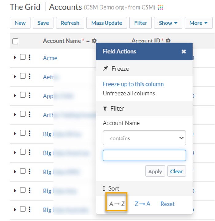 Field actions widget used to sort Field actions widget used to sort |
Fast Filter
User-defined filtering must be enabled on page 1 of the Grid Wizard for the filter section to appear in the field actions widget. Use the filter section to create, edit or remove field filters. When the widget is first opened, the operator will default to “equals” or “contains” depending of the field’s data type. Fields that have an existing filter will show Fields that are picklists, record types, or booleans will have their values accessible by clicking the drop box. Specify a filter value then click Apply. Clicking Apply will save the filter immediately and the grid will be refreshed with the new filter applied. Clicking the Clear button will remove the filter. Changes made using Fast Filters will overwrite any unsaved changes in the full User-Defined Filter widget. If a FastFilter is saved when the (Default filter) option is selected, the filter will be saved with the name “My + [grid
Sort |
Quick Filters
Use quick filter buttons to easily filter grid data. Quick filters can be configured on page 2 of the Grid Wizard. Please see the Field Properties section for
configuration details. When a grid first loads, quick filters buttons are opaque and inactive until the quick filter button has been initialized, after which they will become more prominent and active.
Quick Filter button for the Opportunity Stage field. The button was clicked to open the Quick Filter widget. The Browse section of the widget is shown. Here the Search section of the widget is shown. |
BrowseThe browse section will display picklist values, checkbox values, date literals, etc. for easy selection. For supported data types, browse will display as the default except where there is an existing filter that does not match our browse operator and/or the browse options. The default operator for browse filters cannot be changed. Please see search section to specify a different operator.
For data types that support both browse and search, there will be buttons to switch from browse to search and vice versa. When applying selections from the browse section, any existing filter in the search section Please refer to the Field Properties Quick Filter section for supported data types. SearchThe search section allows the flexibility to filter with more complexity. Search allows for a filter criteria that does not match the browse options and allows the ability to select a specific filter For data types that support both browse and search, there will be buttons to switch from search to browse and vice versa. When applying filter criteria in the search section, any existing selections in |
Metadata panel open at the right side of the grid showing the grid’s conditional formatting rules and filters.
Data Cards
When Data Card is enabled on page 2 of the Grid Wizard for an object, the grid initially only displays the primary fields for the object, and the Data Card fields are not visible. The fields in the Data Card are displayed when the user clicks the
Data Card icon in a grid row.
To configure Data Cards see here.

Grid with Data Cards configured for Accounts and Opportunities. The Data Card is open for the first Account and Opportunity on the grid.
User-Defined Columns
The Reorder/Hide Columns link will appear in the More menu at the top of the Grid if this option was specified on the first page of the Grid Wizard.
To reorder grid columns, click the link to open the widget and drag and drop the column names within the object section vertically. Uncheck the checkbox next to the column to hide it. Clicking the “Save” button will automatically refresh the grid
with the new column display options. The column order and column hiding options will be saved and applied for the current user until the user modifies it again. These options will only be applied for the user that specified them, and other users’
grids will not be affected.
If a user-defined column order is in place, the “Revert” button will be displayed. Click “Revert” to refresh the grid with the default column order defined on page 2 of the Grid Wizard.
Note, user-defined column settings for a particular grid will be deleted if any fields are added or removed on page 2 of the Grid Wizard. Similarly, user-defined column settings will be deleted if any field properties are changed on page 2 of the Grid Wizard
Pagination
Select the number of records displayed on each page from the “Objects per page” drop down at the bottom of the grid in the sticky footer. Navigate among pages by using the pagination links at the bottom of the page, or the page number input.
Navigating does not automatically save your data changes in “Edit” mode.
Resizable Grid Columns
Grid columns can be resized by hovering over the border of a column header, clicking, and dragging. The column width will be persisted between refreshes.
Grid Configuration Changes
Easily make configuration changes while working in a grid by clicking the “Edit Settings”, “Edit Fields”, or “Edit Admin Filters” links under the “More” button. These links will launch the Grid Wizard, and is available for users who have Grid
Wizard access.
Embedding a Grid into SAP Hybris C4C
In order for GridBuddy Cloud grids to show up correctly in Google Chrome, the “third-party cookies and site data” option must be enabled. Under Google Chrome settings, click Show Advanced Settings, and under Privacy, click on Content
Settings. Make sure “Block third-party cookies and site data” is not checked.
To embed a grid into SAP Hybris C4C, follow these steps.
Steps to create a simple mashup pointing to an GridBuddy Cloud grid:
- As an Admin, Go to Administrator > Business Flexibility > Mashup Authoring
Click New button, and select HTML mashup.- Add a name for the mashup.
- Select “Business & Finance” for Mashup Category
- Select “URL” Type. Include a URL to your grid, i.e. https://www.gridbuddycloud.com/grid/embed/8131B0DA-2B70-47BD-84A8-32F6BAC1A760.
- Set a height of 500.
- Click Save

Steps to create a mashup passing parameters, such as record ID, to an GridBuddy Cloud grid:
- As an Admin, Go to Administrator > Business Flexibility > Mashup Authoring
Click New button, and select HTML mashup- Add a name for the mashup.
- Select “Business & Finance” for Mashup Category
- Select the Port Binding for the Work Center object where you will add your mashup.
Different Port Bindings expose different Input Parameters, which you can refer to in a script tag inside the HTML code, and pass in to grid
URL parameters. For example:- For the Sales > Opportunity page in SAP Hybris C4C, select the “Opportunity Info” Port Binding to allow passing in the “OpportunityID” param
- For the Customers > Account page in SAP Hybris C4C, select the “Additional Account Information” Port Binding to allow passing in AccountInternalID” param
- Select “HTML Code” Type
- Set a height of 500.
- In the HTML Code Editor section, add the following code and then click Save:
Example code:
<html><body>
<iframe id=”gridFrame” height=”400″ width=”100″ frameborder=”0″></iframe>
<script>
document.getElementById(‘gridFrame’).src =
‘https://www.gridbuddycloud.com/grid/embed/8131B0DA-2B70-47BD-84A8-32F6BAC1A760?fpf=OpportunityID&fpv=’ + sap.byd.ui.mashup.context.inport.OpportunityID;
</script>
</body>
</html>
In the above example, if your organization has SSO enabled, then please include the subdomain for your organization in the URL.
Steps to add a mashup on an Opportunity page:
- Go to Sales > Opportunities.
- Go to the top menu, Adapt > Edit Master Layout
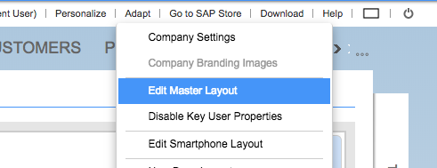
- Depending on the position of your cursor (see with the yellow highlight) click on the ‘+’ button and choose Mashup from the popup menu. You should see you mash-up listed (if you are in the correct layout).
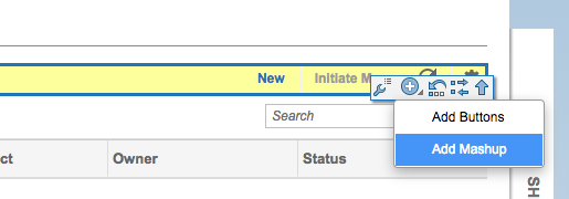
- Check the Visible checkbox next to the mashup you would like to add to the screen
- In the Properties section, check the Full Width checkbox.
- Click the Apply button in the popup
The GridBuddy Cloud grid inside a mashup should now be available on the Sales > Opportunities page.
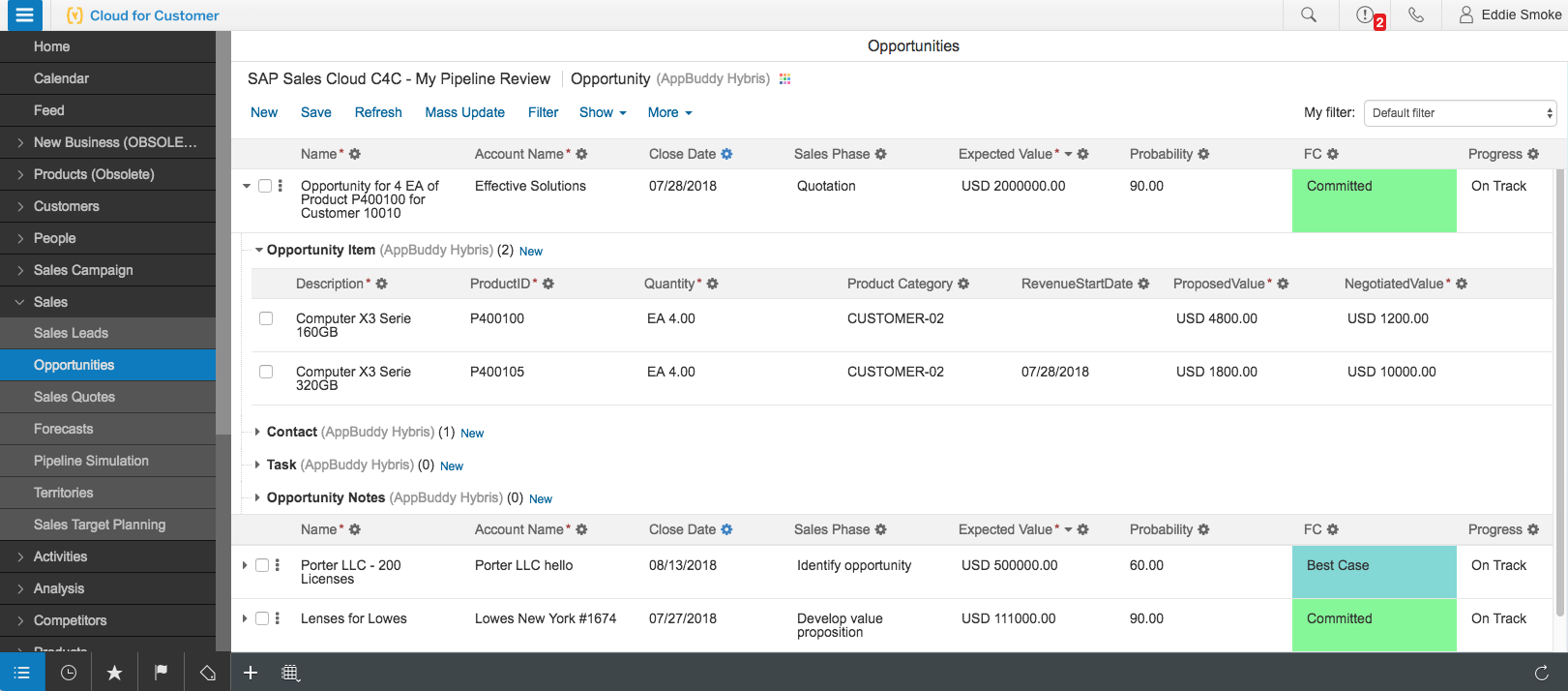
Contact Us
Have questions about how to do something in GridBuddy Cloud? Contact us!