Dark Mode is an accessibility setting developed to minimize blue light and enhance readability by reducing eye strain – an issue that continues to grow as more and more users increase their screen time across a variety of devices. According to recent survey findings on Medium, 83% of Apple and Android users prefer using Dark Mode over their default setting. Dark Mode’s growing popularity is important for email marketers to pay attention to, but why?
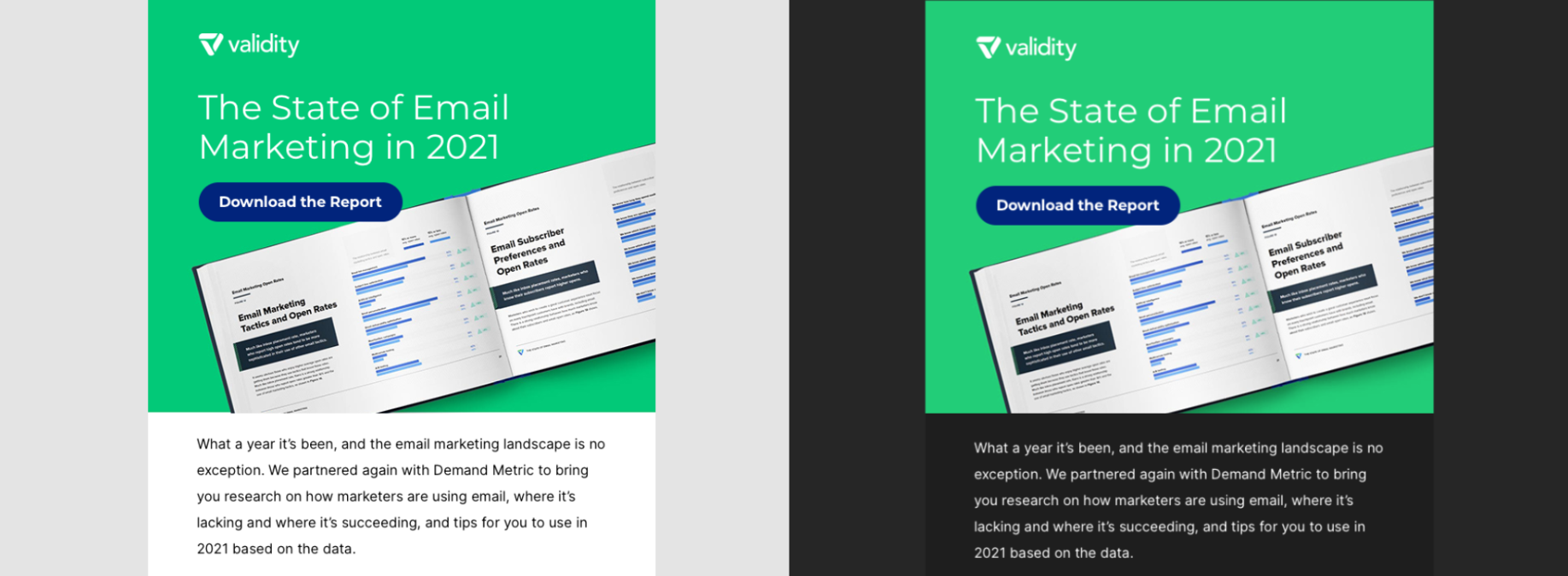
When a user enables Dark Mode within their device settings, it is automatically applied to everything on that device – including emails. This means the emails marketers are sending might appear differently to subscribers who are viewing them in Dark Mode if the creative hasn’t been optimized for this setting.
While marketers ultimately have no control over who sees their emails in Dark Mode, they still have control over what the subscriber sees. Understanding how to optimize email content for Dark Mode can help you improve your brand’s subscriber experience, create lasting relationships, and increase the customer lifetime value.
How does it work?
Dark Mode works by shifting the interface’s color palette to display content in high contrast, using dark background colors and a light foreground. Technically speaking, it checks for any text or background colors with:
- A CSS property of background, color, or background-color
- An HTML attribute of background color
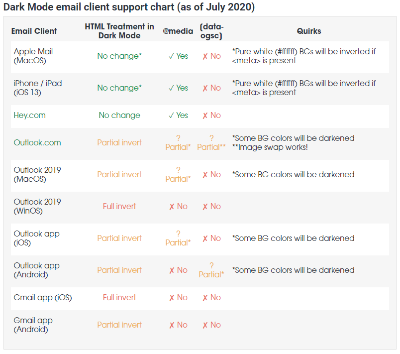
According to Email on Acid, if the text or background color is defined by the CSS or HTML, Dark Mode targets those attributes and adjusts them to appear lighter or darker. For example, if the text is a dark color, Dark Mode would change it to a lighter one. The same thing applies for background colors. However, as you’ll notice in the chart below, each operating system and device execute Dark Mode differently, either partially or fully inverting the colors within the creative. (Image source: Litmus)
Optimize your design for Dark Mode
If you send plain text emails, there’s no need to worry about Dark Mode since the white background will automatically convert to dark, and the black text will turn white. But let’s be honest – what marketer is only sending plain text emails these days? Most marketing emails are HTML, which means different components have strategically distinct and defined colors.
The headache marketers face with Dark Mode comes from the inability to define what subscribers will see, making it difficult to know exactly how the email will look when it renders. That said, here are some tips to help you take back some control and ensure your emails will still look good in both Light and Dark Mode.
1. Test your design in both Light Mode and Dark Mode. One way to know how your email will render is to see the creative with Dark Mode disabled and enabled.
Pro-Tip: Everest, Validity’s email platform, includes a content checker tool called Design & Content that tests your emails in both Light and Dark Mode on various operating systems and devices. This means you won’t have to guess what your subscribers will see before you send the campaign.
2. Use transparent images. A transparent image allows the change in background color to appear more seamless and keeps the design intact. In the below example, a transparent image was used for Sri Chandran, while images with white backgrounds were used for Guy Hanson and Matthew Stith. You’ll notice how Sri’s image blends in much better with the dark background than the other two images.
3. Put a white stroke on your black font for images or icons. Since anything with the color black disappears on a black background, you can put a white stroke on your dark text or icons to improve readability when the background colors change. (Image source: Campaign Monitor)
Conclusion
As more senders work to ensure creatives are compatible with Dark Mode, this will become a feature that subscribers expect, rather than a nice-to-have. Optimizing your content for Dark Mode is worth the effort to ensure you are not harming your subscriber experience, or ultimately, your bottom line. Following these tips, as well as taking advantage of tools like Everest, can help lead you safely into the dark side.


