
Key Takeaways
- Email's "40:1" ROI myth doesn't hold up to scrutiny.
- Return on Relationship measures long-term trust, not just short-term revenue.
- Sending too often backfires—there's a tipping point where churn beats clicks.
In the first installment of this series, we covered the essential financial KPIs every marketing leader should measure and report to business leadership: Total Program Value (TPV), Average Revenue per Message (RPM), Cost per Acquisition (CPA), and Subscriber Lifetime Value (SLV). These numbers show whether changes in program strategy will have a positive or negative long-term impact. Requests for additional investment can then be based on the hard, data-centric evidence that decision-makers value most.
The problem with traditional email ROI
But email’s ROI, while often highly compelling, can also feel “too good to be true”—and it’s often calculated on short-term variables that miss the longer-term picture.
Let’s explore how to account for those factors, and whether new metrics can better capture the value email generates for a business.
Email’s phenomenal ROI is regularly celebrated, and numbers like 36:1 and 42:1 are frequently cited. I’m complicit—I was part of the DMA email council that produced these numbers, based on self-reporting from a broad cross-section of practitioners. The most recent DMA Marketer Email Tracker report quotes just over 40:1.
I’ve always maintained a healthy skepticism about these numbers. In most businesses, there are many competing requests for budget that are evaluated against the potential ROI they will achieve. If email were truly 40:1, it would win those competitions far more often than it does.
Many email ROI calculations underestimate total cost of operation, as well as the cost of acquiring new customers. Considering these more rigorously, we might come to a number in a range between 10:1 and 15:1—still very healthy but still requires you to make a case for securing budget.
Introducing Return on Relationship (RoR)
Email’s true value isn’t just measurable in dollars and cents—there’s intrinsic value too. That’s why we prefer to talk about Return on Relationship (RoR). Instead of asking how much revenue each promotion generates, this metric asks a different question: are your emails building trust and loyalty over time? That means the bigger questions are whether your customers click through from their emails, visit your website, engage with your social media, make purchases, and buy again in the future.
There are several aspects to RoR—both positive and negative—which we’ll now explore.
List churn
Many businesses still fixate on list size, which misses the point—in email marketing, quality beats quantity every time. Monitoring whether a subscriber list is growing or declining provides a far more meaningful indicator of overall program health.
Programs focused on maximizing TPV will avoid doing anything that risks devaluing the asset. A big devaluation driver is list churn: when subscribers opt out, register a spam complaint, or their email address stops working. Viewed in isolation, each metric is usually small—typically a fraction of one percent.
However, when viewed in aggregate (we call this the Disaffection Index), the real impact becomes much clearer. A program losing 0.5 percent of subscribers with each send and maintaining an average sending frequency of twice per week loses half its subscribers in less than a year.
The implications are stark. There is additional CPA to replace each lost subscriber. There is also future SLV that is sacrificed with each lost subscriber (i.e., the revenue they’d have spent in future transactions).
Businesses should redirect email budget to mitigate this challenge. Bringing only high-quality addresses into the program means new subscribers start with higher engagement. Senders should also have the necessary reporting and analytics in place to measure and reduce churn.
Actions:
- Implement a “Disaffection Index” combining all list-churn factors (opt-outs, complaints, hard bounces) into a single metric.
- Overlay this metric against your click-throughs—a value >1 means every email you send is eroding your list instead of energizing it.
- Quantify financial impact—what is the cost of replacing these subscribers, and what is the future revenue you are losing?
List Fatigue
Many programs maintain subscriber engagement scores that draw on behaviors such as opens and clicks, website visits, purchase activity, as well as disengagement factors. These scores provide another measure of overall program health.
This is important—a downside of email’s phenomenal ROI is well-intentioned (or less well-intentioned!) suggestions to “send even more messages!” This may work (up to a point)—total click-throughs will increase, even if click-through rates start dropping.
But programs will inevitably reach an inflection point when increased volume/frequency means total clicks start declining (similar to the Laffer curve when predicting tax revenues). This chart illustrates the principle.
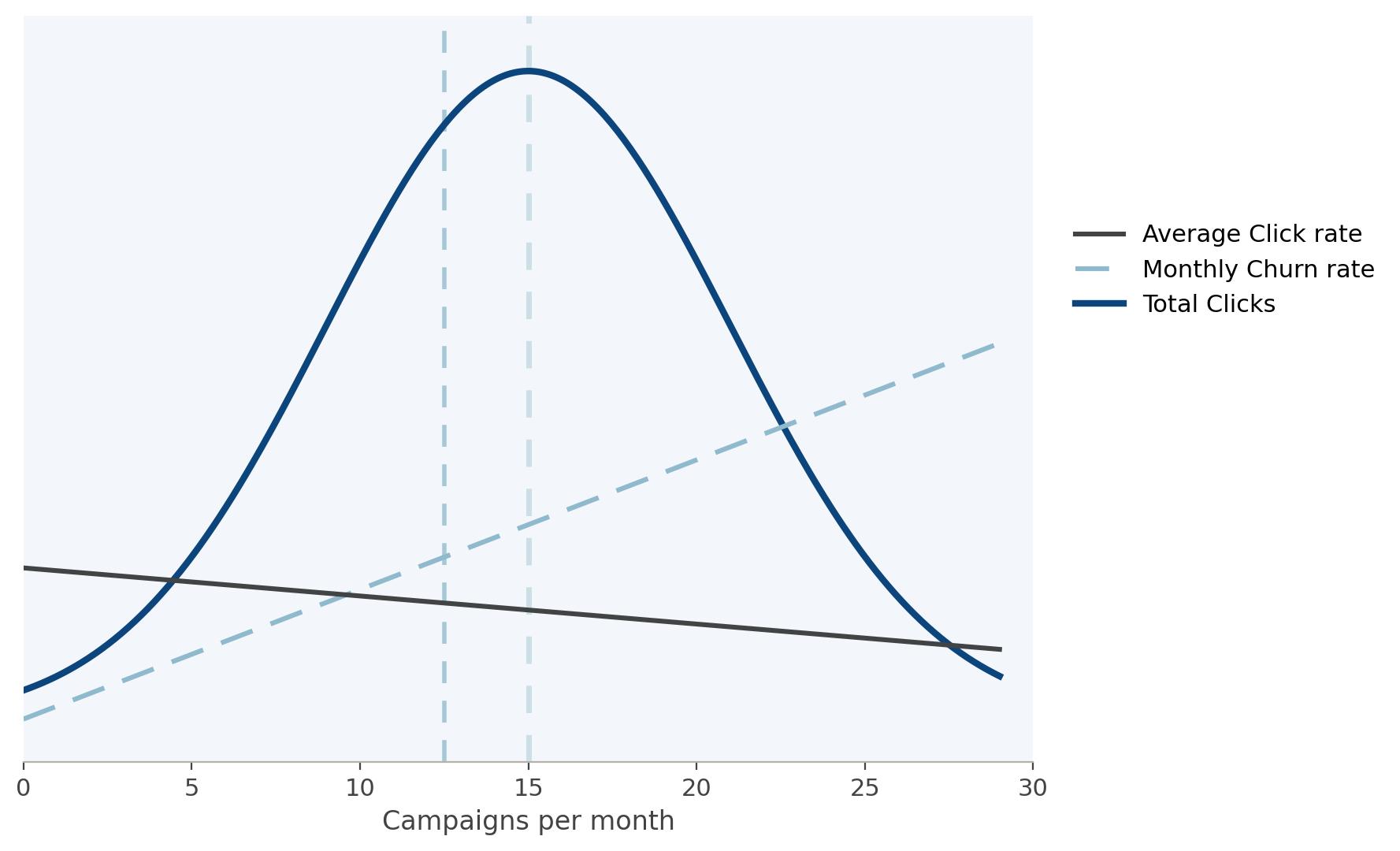
A program sends 2-3 campaigns per week to each subscriber (so around 9-13 per month). Initially, increased frequency delivers more total click traffic, albeit on a diminishing scale. But there is a point (after the yellow line) where fatigue from that increased frequency means total clicks decrease as subscribers tune out—permanently!
Now overlay the corrosive impact of list churn (the red line). Plotting the click-to-churn ratio shows where the gap between clicks and churn is maximized (the green line). Beyond this point, clicks are outweighed by churn, highlighting a level of fatigue that permanently damages the program’s future value.
Actions:
- Implement an “Engagement Inflection Point” metric to quantify when the overall impact of changes in frequency and volume moves from positive to negative (measured by click-throughs, but also by factors like website traffic and revenue).
- Identify where the gap between additional clicks and complaints is maximized and use it as a “proof point” to defend against increasing frequency beyond this point.
Coming up next
Now that we’ve considered how list churn and list fatigue negatively impact RoR, and how to measure these factors so the business goal for short-term revenue is balanced against the relationship goal of long-term tenure, we’re ready for the next step.
Join us next time to look at the flip side of the coin. We’ll examine the most effective tactics to boost email performance and maximize program value.
If you’re looking for more ways to benchmark your email program against your competitors, learn how Validity Engage can help.