

Accessibility is a red-hot topic in the email community. There’s a range of good reasons why senders are laser-focused on accessibility right now:
- Legislation like the Americans with Disabilities Act (ADA) in the U.S. and the Equalities Act of 2010 in the U.K. create legal obligations around accessibility—and penalties for those who fail to comply. For example, in 2019, the U.S. Supreme Court sided with a blind man who sued Domino’s for site accessibility issues.
- Around one in four people now live with some form of disability. These include audiovisual challenges and conditions like dyslexia, color blindness, and astigmatism that make it harder to digest written content. Failure to accommodate these users means a less engaged email audience and lost revenue opportunities.
- Accessibility isn’t just there for people with permanent disabilities. Many of your subscribers will suffer from temporary impairments at some point in their lives, such as a broken arm or an eye infection.
- Implementing accessibility measures allows brands to craft messages that all customers can read and digest. Many accessibility tactics overlap with established email best practices, so it’s not only impaired subscribers who benefit. Smart use of accessibility enhances brand reputation, amplifies ethical positioning, and increases ROI from the email channel.
Implementing email accessibility sounds like a no-brainer, right? Unfortunately, it’s not always easy to get it right. But fear not: We’ve put together this guide of email accessibility best practices to help you get started.
What is email accessibility?
Email accessibility is the degree to which people can understand and engage with the emails you send, regardless of any physical and cognitive impairments they may have, or assistive technology they may use.
Making your emails accessible means making sure that whoever opens them has a smooth, pleasant experience and doesn’t miss out on any information included.
Benefits of creating accessible emails
While making email accessible to everyone should be enough motivation on its own, there are several benefits to creating accessible emails you’ll want to take into account.
They keep you competitive
As stated previously, the number of cognitive, auditory, and visually impaired users is significant. You can either create accessible content for them or lose this chunk of your audience to your competition.
But what if your competitors aren’t focused on making their email content accessible? That’s even better, as you’ll gain a competitive advantage by making the effort.
They increase your potential audience
If you don’t create emails for people with vision impairments, cognitive disabilities, or other impairments, you’re not truly reaching your entire audience. While these people may subscribe to your program, they won’t be able to properly consume your messages. This will lead to frustration, unsubscribes, and a negative image of your brand.
Make your email content accessible to everyone and your number of true leads will likely go up significantly.
They boost engagement and minimize unsubscribes
Related to the above, when you don’t create accessible email content, you’re providing a poor experience for people with disabilities.
Imagine sending an email about a new sneaker launch to someone using a screen reader. They may get excited hearing about the new sneaker. But when they’re ready to buy, they can’t find the link to your shop because you used images without a text alternative for your buttons.
Not only will they be frustrated, they’ll likely unsubscribe as well. They certainly won’t purchase your product.
They minimize legal risk
As awareness around accessibility grows, so does the number of accessibility-related lawsuits. By making accessibility a core part of your email marketing strategy, you can significantly decrease your chances of getting sued and paying hefty fines.
They improve the user experience for everyone
Most best practices for improving accessibility in email marketing are things that improve the email experience for everyone. These include:
- Using a responsive design so your emails are easy to read on mobile devices and different screen sizes
- Picking a font size that’s readable even for those who don’t have perfect sight
- Adding alt text to make images comprehensible for screen reader users
- Picking contrasting background colors to make your text pop out clearly
Email accessibility best practices
In a recent State of Email Live webinar, we polled over 250 email marketers to see how far along they were with accessibility initiatives at their organizations.
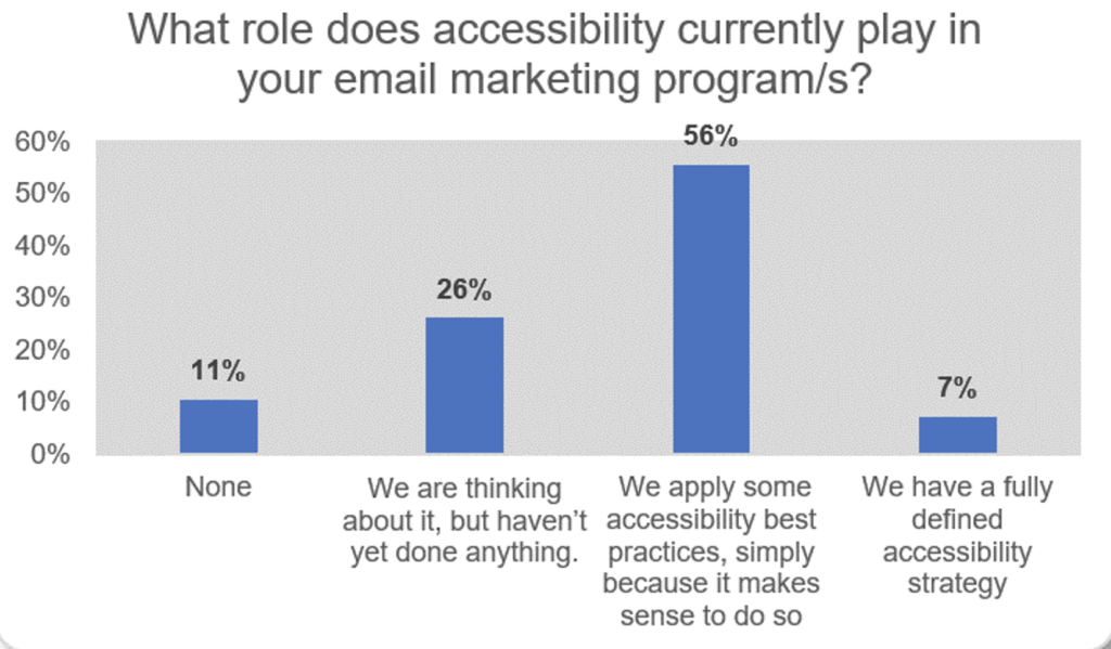
As we can see, it’s a topic that’s front of mind with almost 90 percent of email marketers. But less than 10 percent actually have a defined accessibility strategy.
This isn’t surprising. Email teams are notoriously under-resourced, and implementing email accessibility measures takes time and effort. Accessibility requires collaboration between multiple teams, including copywriting, design, HTML building, etc. And while many web browsers have rendering standards to follow as a guide, most email clients don’t.
To help you improve your email accessibility, here are some best practices to follow. It’s important to note that these best practices aren’t limited to the content of your emails. Whenever your email content sends someone to a landing page, a social media channel, or elsewhere, that off-email content should be accessible too, or you’ll leave your subscribers frustrated.
Carefully choose font size and type
Accessibility guidelines from the Americans with Disabilities Act (ADA) require that font sizes should be a minimum of 14 points. It’s also a good practice to make text resizable (not fixed) so readers can adjust it to a comfortable size for them.
The email below has body copy aligned with ADA requirements.

And while web fonts make it possible to choose the flashiest types of fonts for your emails, it’s best to go with highly legible fonts that are evenly spaced and not too condensed. Sans serif fonts do better in email than serif fonts, for example.
Use enough white space
Some people struggle to read lines of text that are crammed together. So, set a line height that’s four pixels bigger than your font size to create adequate spacing between text lines.
You’ll also want to add sufficient spacing between paragraphs to let screen readers easily scan your email, and padding to the left and right of text blocks so they aren’t glued to the edges of the email viewing pane or to other email elements.
Clearly design your CTAs
CTA text should be meaningful and descriptive, clearly telling users what will happen after they click. “Shop tracksuits” is a better CTA text than “Click here,” for example.
Ideally, your calls to action are displayed as buttons that are large enough to easily be clicked with a finger on mobile devices, and with a cursor on a laptop or desktop by those who struggle with precise movements.
Go easy on the hyperlinks
Try to avoid overloading your messages with hyperlinks. Where links are used, make their purpose clear with a descriptive, meaningful link text and try to use links to reinforce things you’ve already covered in your copy.
Have a clear structure
Email templates should provide readers with structure by using headings, paragraphs, and tags that make content easy to follow. This is also important for screen readers and smart speakers—more on this later.
Don’t use full-text justification
Justified copy is stretched out so it touches both the left and right side of the space it occupies and forms a nice even block. While it looks nice, it introduces inconsistent word spacing that can be hard to read.
On top of that, justified text makes it harder for dyslexics to see where to start reading.
Avoid certain flashing visual content
While GIFs can be a lot of fun, animated GIFs can provoke photo-sensitive seizures. The same goes for videos, especially if they’re high quality.
You don’t need to avoid GIFs and videos altogether, but you do need to make sure that if you use flashing images in your email content, they:
- Don’t flash more than three times per second
- Aren’t too large—larger flashing images are more likely to cause seizures
- Aren’t too bright, flashing from one contrasting color to another
- Don’t include too much of the color red, as that’s more likely to provoke seizures
Optimize for dark mode
Dark mode is a display setting for user interfaces. Instead of the default dark text against a light screen (known as ‘light mode’), dark mode displays a light color text (white or grey) against a dark or black screen.
Dark mode is particularly helpful for people with photosensitivity because it reduces eye strain. It’s also popular with dyslexics, who generally find this format easier to read.
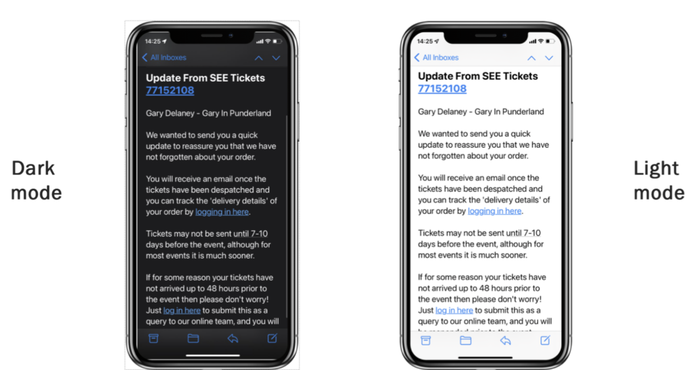
Senders can test if users have dark mode enabled on their devices using a media query. Armed with this information, senders can change colors and text formatting, and show or hide content appropriately.
Dark mode is quickly gaining popularity. Many non-impaired users now prefer to read their emails this way.
Use high color contrast
Good color contrast is crucial for optimal email accessibility. To readers with astigmatism, for example, light text against a dark background may appear blurry. You can prevent this by making sure there is appropriate color contrast between the text and its background.
One way to achieve this is by using a semi-transparent layer behind the text, which provides contrast for both light and dark backgrounds.
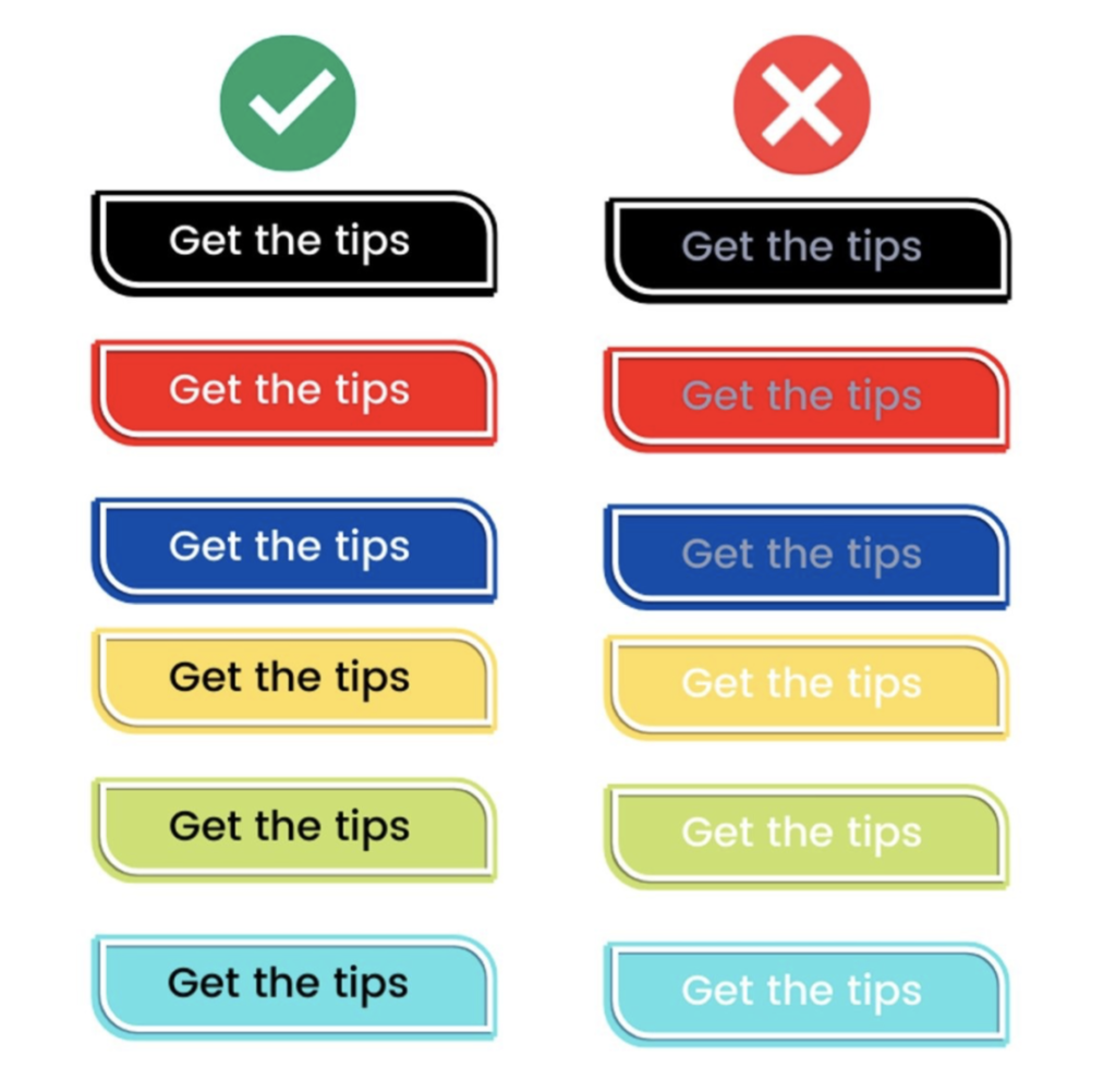
If you’re unsure whether the color contrast in your email is adequate, you can use WebAim’s Color Contrast Checker to find out.
Note: While using colors is a great way to make an email more engaging, colors should never convey a message on their own, as people with color blindness may see colors differently or might not be able to distinguish between some colors.
Create clear or descriptive subject lines
If you want to create more accessible emails, you need to look beyond the body of the email. After all, subscribers won’t benefit from your efforts if they never open your email. Your subject lines need to be accessible too.
Accessible subject lines are either descriptive subject lines or subject lines that are clear when being read by a screen reader.
For example, don’t write “These deals are 🔥” (“These deals are fire”) because a screen reader likely won’t be able to read the fire emoji and your subject line will be meaningless. Instead, have your subject line read “These deals are fire 🔥”
Add meaningful alt text
Images are great for making emails more engaging and showing (rather than telling) your recipients what you want to share. However, not all email clients automatically display images, and not all subscribers are able to see your images. So, it’s important to include a descriptive alt attribute for each image.
When an image can’t be displayed, the text in the alt attribute is shown. It is also the text screen readers read when they scan an image.
Good accessibility means using meaningful alt text to describe what each image shows. The alternative text should be displayed over images where it can be read, rather than embedded within.
That being said, not all images should be read by screen readers. If an image is merely decorative rather than functional or illustrative, you can give it a null alt attribute and screen readers will skip over it.
If you’re not sure which images in your email require alt text and which ones don’t, view your email with all images turned off. You’ll quickly see where alt text is needed to not lose part of the message.
Avoid tables
A key issue for email accessibility is the use of tables in emails. Content in a table is often presented by column (top to bottom), but it’s read by row (left to right). This is difficult for most screen readers to correctly interpret.
You can add role=”presentation” to a table that has content that needs to be read (versus a table that acts as design elements), but even then, screen readers may struggle to interpret the content correctly.
Include semantic HTML
Styling semantic HTML such as <p> paragraph and <h> heading tags in emails isn’t easy and therefore isn’t commonly done. But, it can add another level of accessibility by allowing screen readers to scan your email header by header and paragraph by paragraph.
Semantic elements can also be used to identify images and links for screen readers and let them know which email elements should be read aloud and which can be ignored.
Provide captions for audio
Speaking of screen readers, good email accessibility takes into account all possible impairments your subscribers may have, not just visual impairments. If you include any type of audio in your emails, make sure to provide captions for hearing-impaired recipients.
How to get started
We’ve spoken with dozens of email marketers who are already focused on making their emails accessible and asked them for tips on how to get better at creating accessible emails. They came back with great advice on how to implement accessibility initiatives throughout your email marketing campaigns.
Ask someone who knows
It can be difficult to empathize with situations or conditions you’ve never personally experienced, let alone fully grasp how impaired subscribers experience email marketing. If you’ve never had to cope with the frustration of dyslexia, for example, speak with people who have. Draw on their experiences to design emails that are easier to engage with.
Sing an ARIA
Accessible Rich Internet Applications (ARIA) is a web accessibility initiative by the World Wide Web Consortium (W3C). It defines a set of attributes that can be added to HTML elements to make web elements and interactive content more accessible to users with disabilities.
ARIA doesn’t affect your email’s design. It only adds descriptive information so assistive devices can more easily understand its content.
Try accessibility tools
There are various email tools—like Validity’s Everest email success platform—that help senders understand how their emails render across desktop and mobile devices as well as different email clients. Several email clients have their own email accessibility checkers, and clever technology like predictive eye tracking also helps senders understand how subscribers navigate their emails.
Use accelerated mobile pages
Accelerated mobile pages (AMP) provide email senders with a broad selection of accessibility-friendly solutions. Embedding web functionality like image carousels and interactive forms into emails makes messages easier to navigate and engage with. These measures also make subscribers more likely to convert.
Implement quality assurance measures
Accessibility should become part of every sender’s quality assurance process. Confirming your emails are accessible to all audiences might require render and other email testing, the use of automated contrast checkers, using Alexa/Siri to read the emails, and even deploying tools like the Gunning Fog Index to eliminate unnecessary wordiness.
Embrace cross-channel accessibility
While this article focuses on email accessibility, it should be clear that accessibility should be a point of attention across all marketing channels and points of contact with the customer. That includes your company website, social media channels, and call centers.
Email accessibility matters
Accessibility is a complex, evolving topic, but that doesn’t mean you should ignore it. Doing so would mean ignoring a significant part of your potential audience and losing out on sales because of it.
Your subscribers are already doing their part by using screen readers and other assistive technologies. Now it’s up to you to meet them where they are.
If you want to serve (and sell to them!) more effectively, download our Ultimate Email Marketing Toolkit to learn how you can take your email marketing to the next level.